Auto- and cross-correlation plots
Packages: dplyr, tidyr, tibble, ggplot2, ggdist, ggcorrplot
An auto-correlation is the correlation between the current values of a variable and the values of the same variable lagged for one timepoint. A cross-correlation is the correlation between the current values of a variable and the values of another variable lagged for one timepoint. This type of correlation can provide interesting information whenever the temporal dynamics or dependency of affects or behaviors are of interest. An important consideration is to choose a lag that is meaningful. It is often an lag 1 that is used, but it can be different depending on the research question or the nature of the data.
Full sample auto- and cross-correlation
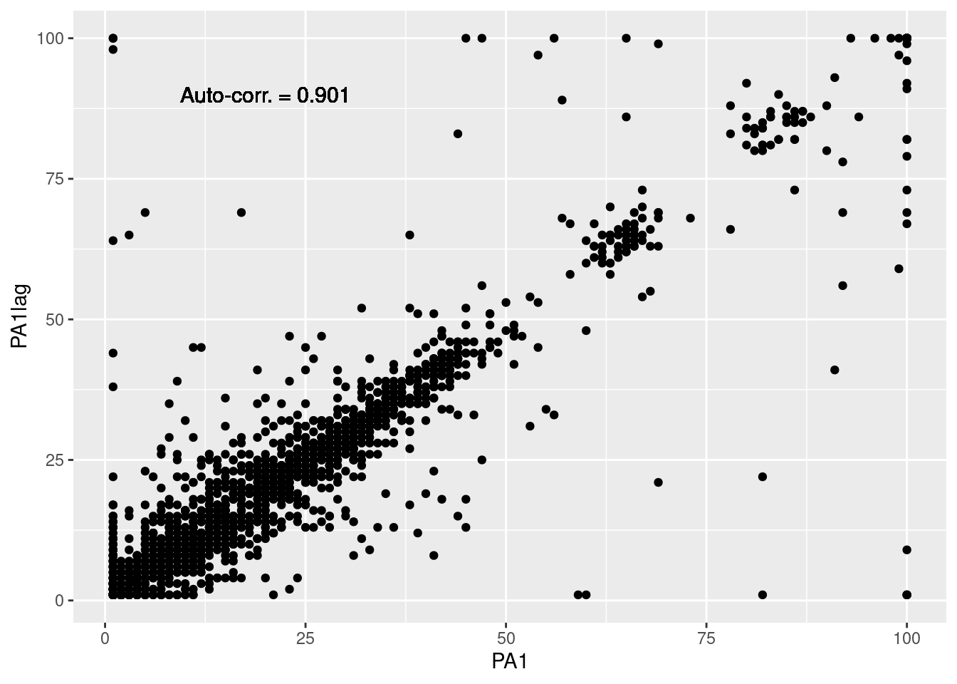
The most basic way to look at either auto- or cross-correlations is to create a scatter plot and integrate the correlation coefficient. However, even if we are computing the auto- and cross-correlations for the full sample, we need to consider the nested structure of the data (i.e., the observations are nested within participants and days). To do so, we have to lag the variables in consequence. Here, we group the data by participant and day, before lagging the variables. The resulting lagged variables are named with the suffix “lag” (e.g., PA1lag, PA2lag, etc.). To learn more about lagging, refer to the Lag plot section.
# Lagging taking into account the nested structure
df = data %>%
  group_by(id) %>%
  mutate(daycum = difftime(as.Date(sent), as.Date(min(sent, na.rm=TRUE)), units="days") + 1) %>%
  group_by(id, daycum) %>%
  mutate(across(c(PA1:NA3), ~lag(.), .names = "{.col}lag")) %>% # Lag the variables
  ungroup()

# Scatter plot of PA1 and PA1lag
df %>%
  ggplot(aes(x=PA1, y=PA1lag)) +
    geom_point() +
    geom_text(aes(label = paste("Auto-corr. =", round(cor(PA1, PA1lag, use="complete"), 3))),  # Add the correlation coefficient
              x=20, y=90, # Position of the text
              size=4) # Size of the text
We can go a step further and compute the auto- and cross-correlations for each combination of variables and lagged variables. First, we have to compute the auto- and cross-correlations for each variable based on the ‘df’ dataframe created above. Then, we can transform the results into a matrix to fit later visualization functions.
# Prepare loop
df_corr = data.frame() # store results
vars = c("PA1","PA2","PA3") # Variables of interest

# Loop over each variable
for (var1 in vars){
  for (var2 in vars){
    corr = cor(df[[var1]], df[[paste0(var2, "lag")]], use="complete")
    df_result = data.frame(var=var1, varlag=paste0(var2, "lag"), cor=corr)
    df_corr = rbind(df_corr, df_result)
  }
}

# Transform in matrix
cor_mat = df_corr %>%
  spread(varlag, cor) %>%
  tibble::column_to_rownames(var="var") %>%
  as.matrix()
As for the correlation plot section, we propose different visualisations:
- ‘ggcorrplot()’ from the ggcorrplot package. Many arguments of the function can be used to personalize the plot such as ‘method’, ‘hc.order’ and ‘lab’.
- ‘heatmap()’, an R base function. Use to create a simple heatmap of the estiamted correlations coefficients.
- ‘geom_tile()’ from the ggplot2 package.
library(ggcorrplot)
ggcorrplot(cor_mat,
           hc.order = TRUE,
           lab = TRUE,
           ggtheme=theme_bw)
ggcorrplot(cor_mat,
           hc.order = TRUE,
           lab = TRUE,
           method="circle",  # With circle
           ggtheme=theme_bw)
Participants’ distribution
For further distribution plots, see the Distribution plots section. To see more about lagging in plots, you can refer to the [Lag plot](../pages/80_LIn the above plots, we took into account the nested structure of the data when lagging the variables but not when computing the auto- and cross-correlations. In addition to respecting the data’s structure, the auto- and cross-correlations at a participant level can be used to explore inter-individual or group differences.
Again, the first step consists in computing the auto- and cross-correlations for each combination of variables, and for each participant. ag_plots.html) section. Importantly, consider excluding participants which have a low number of valid observations (i.e., low compliance) as they may bias the results. Here, we arbitrary set a threshold at 30 valid observations.
# Lagging taking into account the nested structure (i.e., participants and days)
df = data %>%
  group_by(id) %>%
  mutate(daycum = difftime(as.Date(sent), as.Date(min(sent, na.rm=TRUE)), units="days") + 1,
        nb_valid = sum(valid)) %>% # Compute the number of valid observations per participant
  group_by(id, daycum) %>%
  mutate(across(c(PA1:NA3), ~lag(.), .names = "{.col}lag")) %>%
  ungroup() %>%
  # Exclude participants with low compliance
  filter(nb_valid >= 30)


# Prepare loop
df_ppcorr = data.frame() # store results
vars = c("PA1","PA2","PA3") # Variables of interest
ids = unique(df$id)

# Loop over each variable
for (var1 in vars){
  for (var2 in vars){
    # Compute the correlation nested in ids
    corr = unlist(lapply(ids, function(x) cor(df[df$id==x,var1], df[df$id==x, paste0(var2, "lag")], use="complete")))
    # Store results
    df_result = data.frame(var=var1, varlag=paste0(var2, "lag"), id=ids, cor=corr)
    df_ppcorr = rbind(df_ppcorr, df_result)
  }
}
From the above computation, we get a dataframe that contains the auto- and cross-correlations for each participant and each combination of variables.
df_ppcorr %>% head(5) var varlag id cor
1 PA1 PA1lag 1 0.9781189
2 PA1 PA1lag 2 0.6518540
3 PA1 PA1lag 3 -0.5235745
4 PA1 PA1lag 4 0.8070569
5 PA1 PA1lag 5 0.6976971Using this dataframe, we propose different visualizations to display the distribution of participants’ auto- and cross-correlations between the different variables:
- Box plot: the x-axis represents the variables, and each panel is a different lagged variable.
- Box plot and density: the same as the previous plot but with the addition of a density plot.
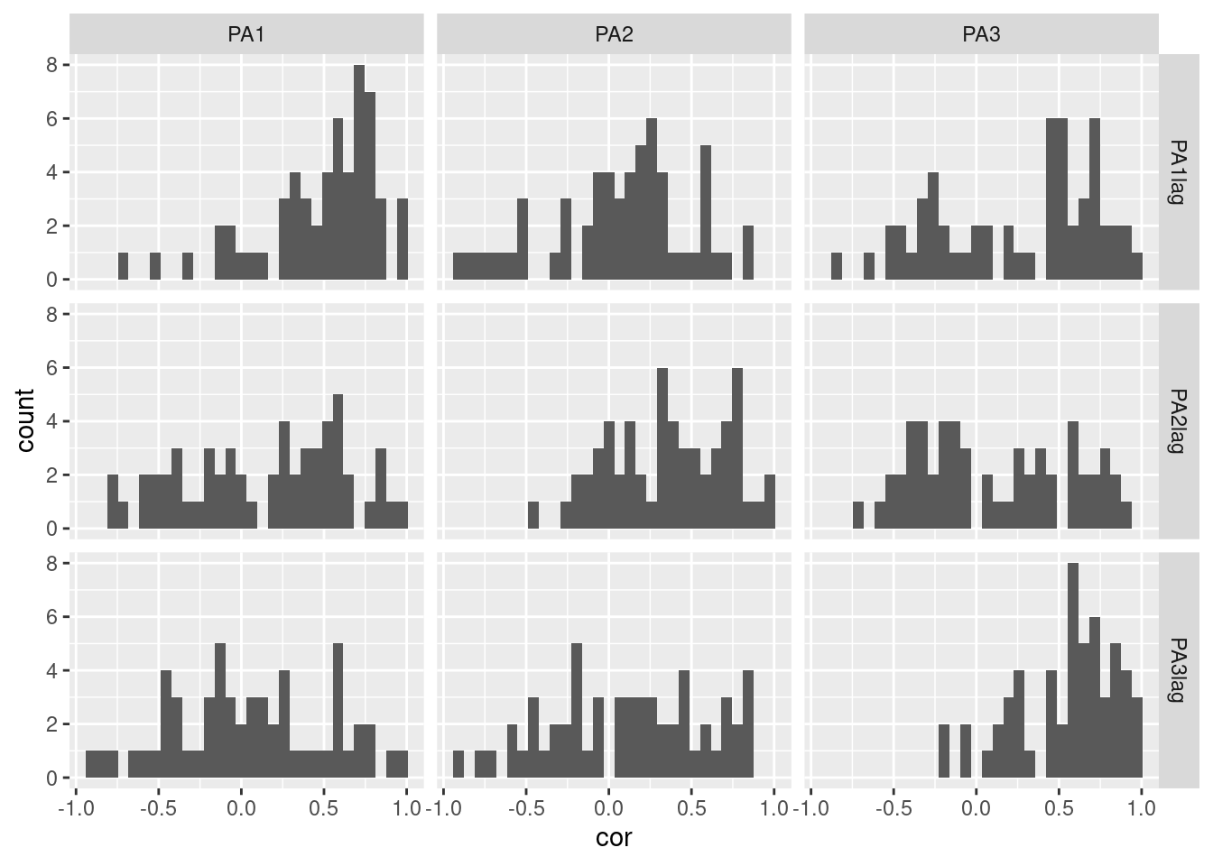
- Matrix of histograms: each panel is a different combination of variables and lagged variables.
- Matrix of histograms and density plots: the same as the previous plot but with the addition of a density plot.
df_ppcorr %>%
  ggplot(aes(y=cor, x=var, color=varlag, fill=varlag)) +  # Display variable on the two axis of the plot
    geom_jitter(width = .2) +  # Create points on the plot and put space between them
    geom_boxplot(outlier.shape=NA, fill=NA, width = .3, size = 1.2) + # Create the boxplot
    facet_grid(varlag~.)
For further distribution plots, see the Distribution plots section. To see more about lagging in plots, you can refer to the Lag plot section.


