Lag plots
Packages: dplyr, tidyr, ggplot2, forecast, ggpubr
Content for Option 1 goes here.
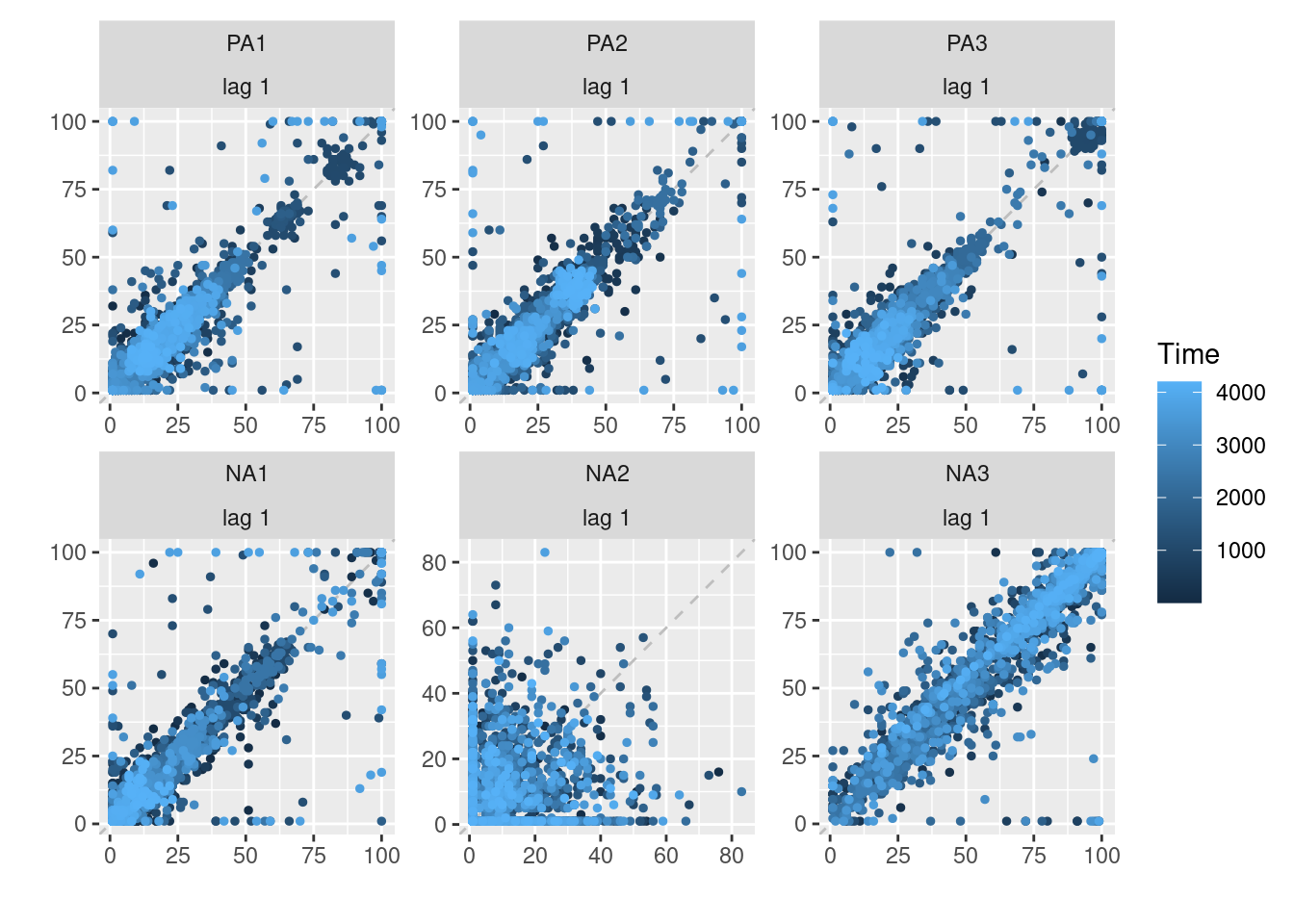
Lag plots are useful for investigating autocorrelation in time series data, which is often present in ESM data due to the repeated measurements from the same individuals over time. By plotting a variable against itself with a lagged version of the same variable, the relationship between a variable and its past values can be explored. Going further, we can also plot crosscorrelation. The correlation of one variable with another variable at previous times. Overall, this can help identify patterns or trends in the data and inform the choice of appropriate statistical models.
Scatterplots
To investigate an autocorrealtion, the simplest is to create a scatter plot, as follows:
data %>%
    group_by(id) %>%
    mutate(PA1_lag = lag(PA1)) %>%
    ggplot(aes(x=PA1_lag, y=PA1)) +
        geom_point()
Identically, crosscorrelation can also be plotted in scatter plot:
data %>%
    group_by(id) %>%
    mutate(PA2_lag = lag(PA2)) %>%
    ggplot(aes(x=PA2_lag, y=PA1)) +
        geom_point()
Functions already exists to display specifically autocorrelation of the variables selected. In particular:
- lag.plot function from the stats package
- gglagplot() function from the forecast package
names_vars = c("PA1","PA2","PA3","NA1","NA2","NA3")
lag.plot(na.omit(data[,names_vars]))
To have a broader view, we can display each lag(1) auto and cross-corelation between the variables of interest. If we have 4 variables, then we have 4 autocorrelations and 4*3=12 crosscorrelations to investigate. To create this plot, you need to:
- Select the variables of interest.
- Gather their values in a column.
- Create a lagged version of the values while grouping for the participant and the variable itself.
- Self-merge the dataframe to have side by side each combinaison of variables to be able create the crosscorrelation plots.
- Create the plot
# Select, gather and create lag variables
data_matLag = data %>%
    dplyr::select (id,obsno,PA1:NA1) %>%
    gather(ESM, value, PA1:NA1) %>%
    group_by(id, ESM) %>%
    mutate(value_lag = lag(value))

# Self merge for crosscorrelation plots
data_matLag = data_matLag %>%
    dplyr::select(-c(value_lag)) %>%
    left_join(dplyr::select(data_matLag, id:ESM,value_lag), by=c("id","obsno"), suffix = c("", "_lag"))

# Create the plot
library(ggpubr)
data_matLag %>%
    ggplot(aes(x=value_lag,y=value)) +
        geom_point(alpha = .2) +
        stat_cor(method = "pearson", label.x = 3, label.y = 30, color = "red", size = 3, fontface = "bold") +
        facet_grid(cols=vars(ESM), rows=vars(ESM_lag))
Because ESM data is often a high-density data type, it can be instructive to display the distribution of the variables in those scatter plot. To do so, we only need to use the geom_bin2d() instead of the geom_point() function (see more in the custom scatter section)
library(ggpubr)
data_matLag %>%
    ggplot(aes(x=value_lag,y=value)) +
        geom_bin2d() +
        stat_cor(method = "pearson", label.x = 3, label.y = 30, color = "red", size = 3, fontface = "bold") +
        facet_grid(cols=vars(ESM), rows=vars(ESM_lag))
xxx
IN DEVOLOPMENT
Time as a conditioning or grouping variable: weeknr, obsno, etc. (see also delimite plots, ??? sections).
data %>% filter(id == 1) %>%
  mutate(wday_ = ifelse(wday(sent) %in% c(1,7), "weekend", "weekday")) %>% # In function of week end
  ggplot(aes(x=PA1,y=lag(PA1), color=wday_)) +
    geom_point()
data %>% filter(id == 1) %>%
ggplot(aes(x=PA1,y=lag(PA1), color=period)) +
geom_point()Segment the obsno by x
seq_obsno = seq(0, max(data$obsno), length.out=5) # 5 -> give 4 segments
data %>% filter(id == 1) %>% ungroup() %>%
  rowwise() %>%  # Make the maw function to be computed by rows (and not overall or by group)
  mutate(beeps_cat = max(which(seq_obsno < obsno))) %>%  # In function of cat of beep (1-10, 10-20, etc.)
  ggplot(aes(x=PA1,y=lag(PA1), color=factor(beeps_cat))) +
    geom_point()
Spaghetti plot
To visualize lag relationship between variables, we can also use a spaghetti plot. In this type of scatter plot, the data points are displayed in fonction of a categorical variable (on the x-axis) while the data point belonging to a same group (such as an individual or a same row) are linked with a line. In our case, the categorical variable is modality of the observation (time t or time t-1) and the group is the row number. In addition, you can choose to display the observations of one individual, one subgroup or of the whole sample, knowing that too much data may blur potential within-person relationships.
The step are the following ones:
- Create the grouping variable that is the row number
- Create lag variable grouping by the participant id
- Gather the variables values together
- Plot the relationship
In function of the variable lagged, you can create a auto or crosscorrelation plot (here for 1 participant):
data %>%
    mutate(row = 1:n()) %>%
    group_by(id) %>%
    mutate(PA1_lag = lag(PA1)) %>%
    gather(variable, value, PA1, PA1_lag) %>%
    filter(id == 1) %>%
    ggplot(aes(x=variable, y=value)) +
        geom_violin(aes(fill=variable)) +
        geom_point() +
        geom_line(aes(group=row))
We can also choose to display multiple participants, either gather in one plot (investigating strong group relationship) or one per plot.
data %>%
    mutate(row = 1:n()) %>%
    group_by(id) %>%
    mutate(PA1_lag = lag(PA1)) %>%
    gather(variable, value, PA1, PA1_lag) %>%
    filter(role == 1 & id <= 31) %>%
    ggplot(aes(x=variable, y=value)) +
        geom_violin(aes(fill=variable)) +
        geom_point() +
geom_line(aes(group=row)) 
Finally, you can choose to display more than one variable or lagged version of a variable. Note that the order in which the variables are displayed on the x-axis is determined by the order in which those variables are specified in the gather function.
data %>%
    mutate(row = 1:n()) %>%
    group_by(id) %>%
    mutate(PA1_lag1 = lag(PA1), PA1_lag2 = lag(PA1, n=2)) %>%
    gather(variable, value, PA1, PA1_lag1, PA1_lag2) %>%
    filter(id == 1) %>%
    ggplot(aes(x=variable, y=value)) +
        geom_violin(aes(fill=variable)) +
        geom_point() +
        geom_line(aes(group=row))


