Correlation plots
Packages: dplyr, tidyr, tibble, ggplot2, GGally, ggcorrplot, lares
Correlation plots allow us to visualize the relationships between different variables in the dataset. By examining the correlation coefficients between pairs of variables, we can identify patterns and potential dependencies that can inform our analyses. Additionally, correlation plots can help identify multicollinearity issues, which can impact the results of statistical models.
We present different ways to create correlation plots. Note that you often need to create a subset of the data that contains only the variables of interest.
- ‘ggpairs()’ function from the GGally package. In addition to correlation plots, it can also integrate scatterplots, distribution plots, etc.
- ‘heatmap()’, an R base function. Use to create a simple heatmap of the estiamted correlations coefficients.
- ‘ggcorrplot()’ from the ggcorrplot package. Many arguments of the function can be used to personalize the plot such as ‘method’, ‘hc.order’ and ‘lab’.
- ‘geom_tile()’ from the ggplot2 package.
library(GGally)
var_names = c("PA1","PA2","PA3","NA1","NA2","NA3")
data_mat = na.omit(data[,var_names])
ggpairs(data_mat)
ggpairs(data_mat,
    upper = list(continuous = "density", combo = "box_no_facet"),
    lower = list(continuous = "points", combo = "dot_no_facet"))
Rather than a correlation matrix, correlations can be displayed in a bar plot. In particular, we display two functions from the lares package:
- ‘corr_var()’: display the correlations of all variables with one target variable.
- ‘corr_cross()’: each possible correlation is displayed as a bar. Because it can be overwelming, we can choose to display only the n highest correlations with the ‘top’ argument (e.g., top=10).
Participant correlation plot
The previous plots ignore that the observations are nested within participants. The correlation coefficients within each participant can be used to explore inter-individual or group differences as, for instance, whether certain variables are consistently related or if the strength of their relationships varies between participants. Firstly, we need to compute correlation coefficients for each participant and for each combination of variables.
# Compute correlation for each variable combinations
cor_vars = function(x, y){
  lval = split(x, y)
  comb_vars = gtools::combinations(length(unique(y)), 2, unique(y), repeats.allowed = TRUE)
  df = as.data.frame(comb_vars)
  df[,3] = NA
  for(i in 1:nrow(df)){
    df[i,3] = cor(lval[[df[i,1]]], lval[[df[i,2]]], use="complete")
  }
  names(df) = c("v1","v2","cor")
  df
}

# Create dataframe variables' correlations for each participant
df_cor = data %>%
  gather(var, y, PA1:NA3) %>%
  group_by(id) %>%
  summarise(cor_vars(y, var))
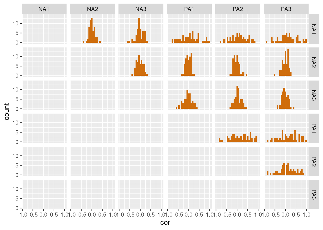
Based on this dataframe, we can create histogram plots that display the distributions of participants’ correlations between the different variables.
df_cor %>%
  mutate(cor = ifelse(v1==v2, NA, cor)) %>% # Remove correlation with variables themselves
  filter(v1!=v2) %>%
  ggplot(aes(x=cor)) +
    geom_histogram() +
    facet_wrap(v1~v2)
df_cor %>%
  mutate(cor = ifelse(v1==v2, NA, cor)) %>% # Remove correlation with variables themselves
  ggplot(aes(x=cor)) +
    geom_histogram() +
    facet_grid(v1~v2)
Another way to investigate between-participant differences is to directly compare participants’ coefficients. Using the previous dataframe, we plot the estimated coefficients per variable combination, while grouping the values according to the participants. The downside is that is we have many participants (and many variables), the plot can be easily overwhelming. Below, we display only a subset of 15 participants.
df_cor %>%
  filter(id < 15,
         v1 != v2) %>%  # Remove correlation with variables themselves
  mutate(var_comb = paste0(v1, "_", v2)) %>% # Merge variable combinaisons
  ggplot(aes(x=var_comb, y=cor, group=id)) +
    geom_point() +
    geom_line() +
    theme(axis.text.x = element_text(angle = 90, vjust = 0.5, hjust=1))


