Distribution plots
Packages: dplyr, tidyr, ggplot2, ggdist, likert, ggridges
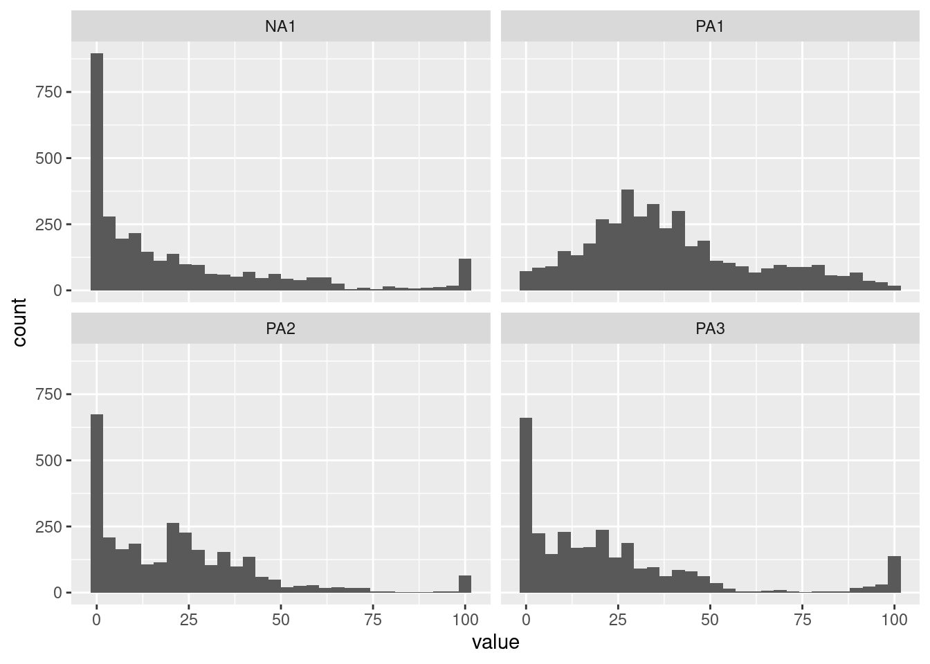
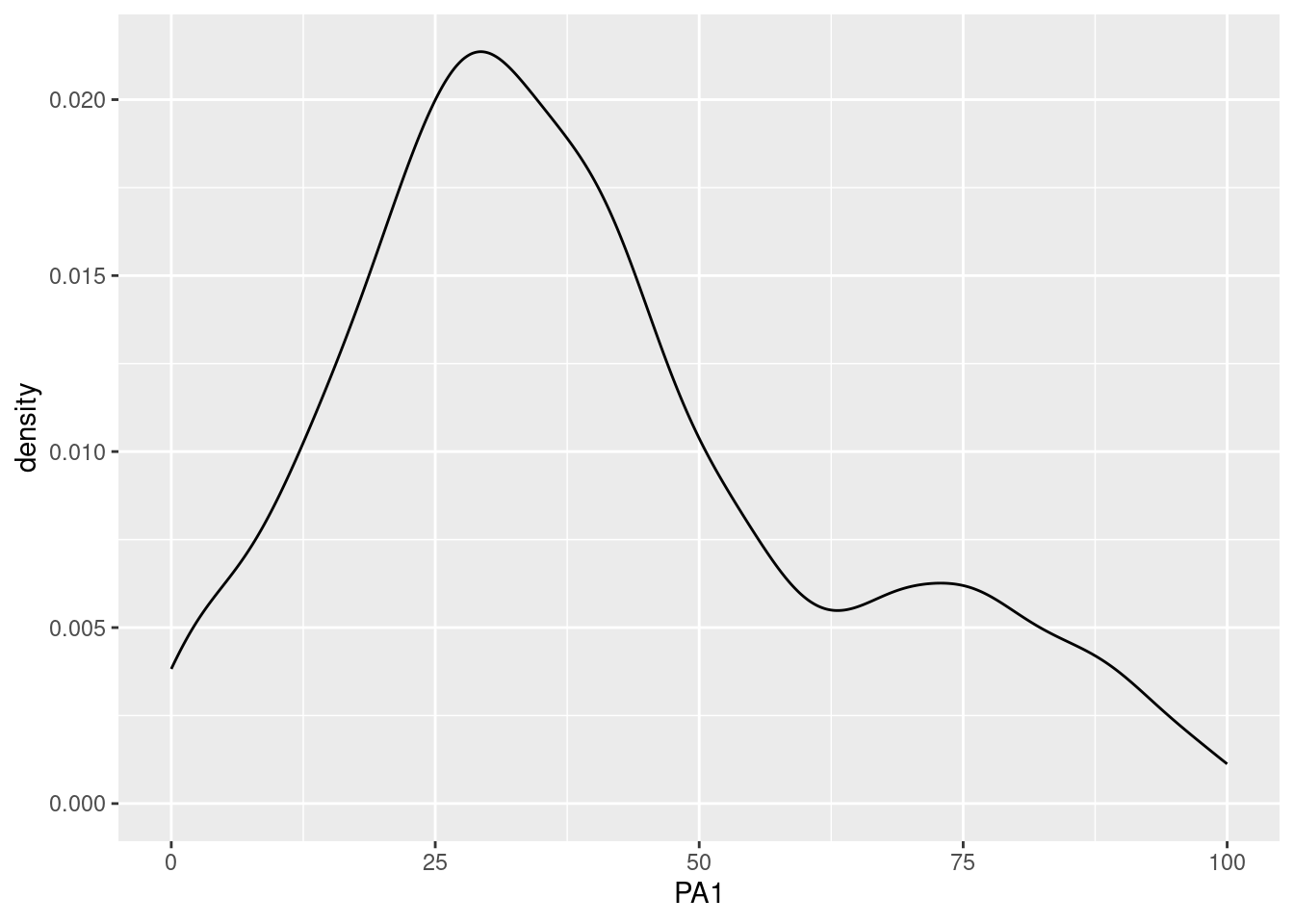
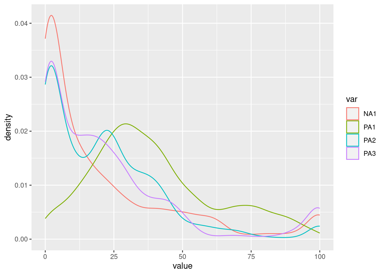
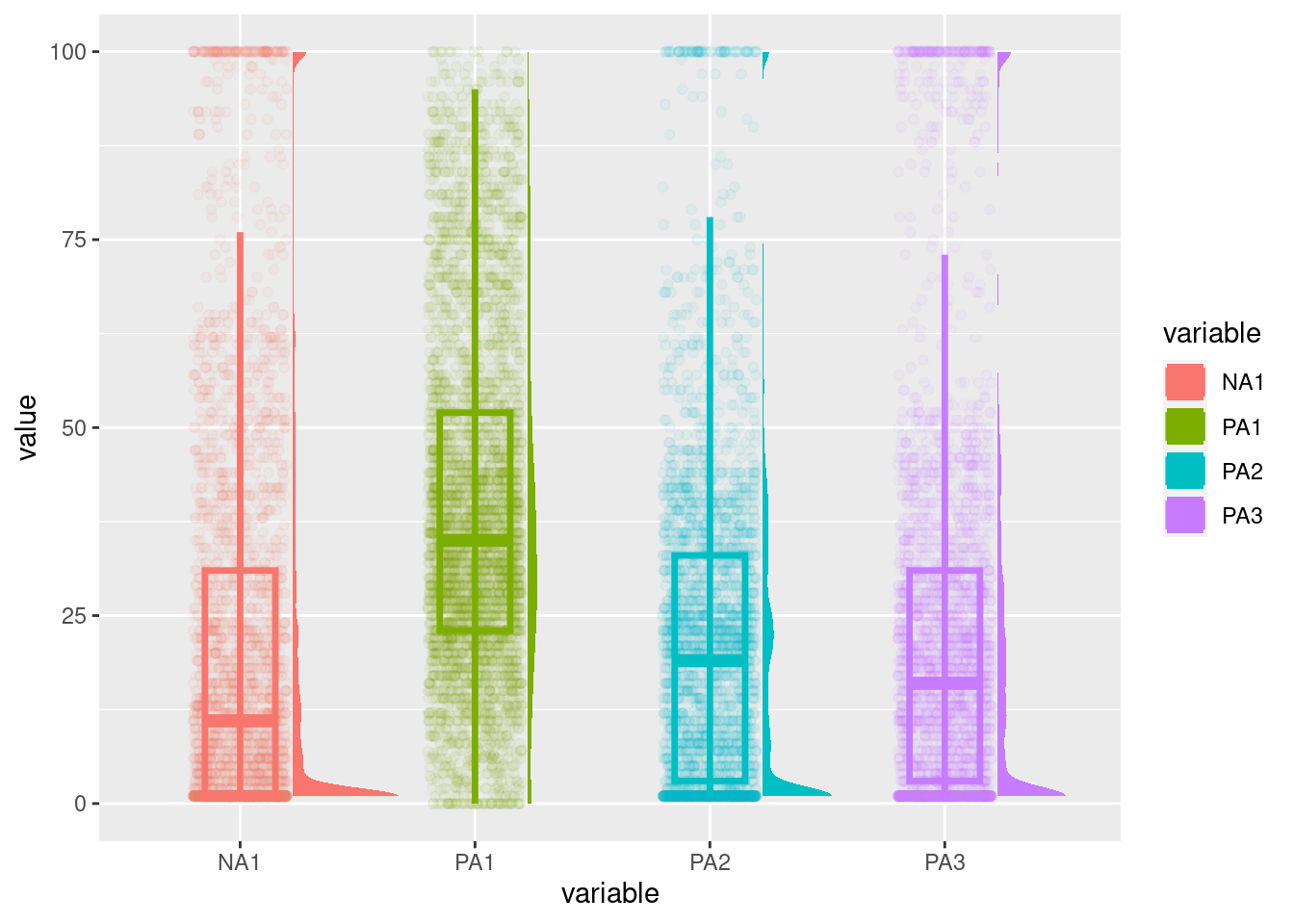
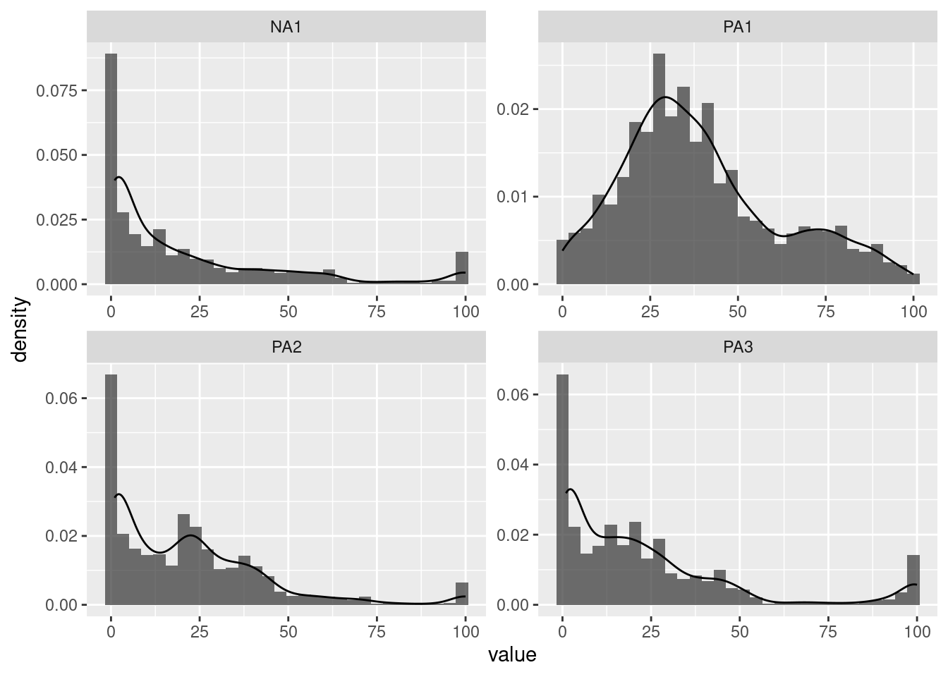
Investigating the distribution of variables in an ESM dataset is crucial. Examining the distribution can provide insights into the data, such as whether it is normally distributed or skewed, whether it contains outliers or extreme values, whether it has floor or roof effects, and whether it has different distribution modalities (unimodal, bimodal, multimodal). Furthermore, it is important to ensure that the distribution of the data meets the assumptions of statistical models, such as normality, homogeneity of variance, and independence of observations. Histograms can help to identify deviations from these assumptions.
Different types of plots allow this investigation. For all of them, it is possible to display only one variable or multiple variables.
Conditional distributions: grouping for variables
Participants and groups
The shapes of the distributions such as modalities (e.g., unimodal, bimodal, multimodal) and others (e.g., skewed) can also be inspected for participants or groups. To do so, we can plot:
- a unique variable and multiple participants
- multiple variables and participants
- a unique variable and multiple participants with density functions.
Note that the ‘filter()’ function is used to select the participants to display. Displaying all participants can be overwhelming in function of the plot type and the number of participants.
data %>% filter(id %in% c(1, 30, 50)) %>%
ggplot(aes(x=PA1)) +
geom_histogram(bins=30) +
facet_grid(id~.)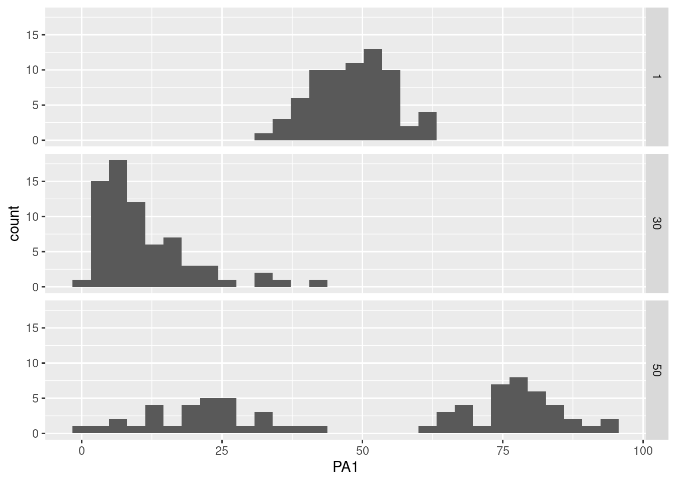
To investigate group differences, the participant identification variable (“id”) that we used in the previous plots can be replaced by a group variable (for instance ‘cond_perso’) for the next plots. Because groups often have multiple modes, we can unite the distributions in the same plot, as follows:
data %>%
ggplot(aes(x=PA1, color=factor(cond_perso))) +
geom_histogram(aes(y = ..density.., fill=factor(cond_perso)), alpha = 0.2) +
geom_density(alpha = 1) 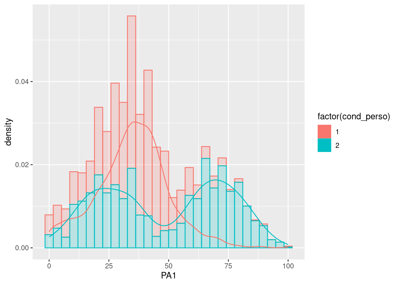
Time variables
ESM studies unfold during a period of time and questions are often asked multiple times a day. As life follows periods, it is probable that distributions of variables (e.g., positive affects, energy) can differ over time, such as between periods of the day, between days in a week or between different weeks. Again, the above plots can be used to explore such differences by grouping distributions based on time variables. For instance, the below plot allows us to investigate if there are differences in distributions at different periods of the day (i.e., morning, afternoon).
data %>%
    ggplot(aes(x=PA1)) +  # Display variable on the two axis of the plot
geom_histogram() +
facet_grid(period~.)
Categorical and Likert scales
In addition to the widespread utilization of slider scales in ESM studies, it is important to note that categorical and Likert scales (ranging from 1 to 7) are also frequently employed. Especially for Likert scales, the Likert package can be employed. This package provides convenient functionalities to generate visually appealing distribution plots of Likert scale responses, helping to gain insights into the patterns and distributions of participants’ ratings across the scale items.
Firstly, we have to do a quick preprocessing of the categorical or Likert items we want to plot. They need to be in a factor format and the levels must be ordered and named. In our example the labels are: “never”, “rarely”, “occasionally”, “sometimes”, “frequently”, “often”, “always”. Here, the order perfectly fits the Likert scale values used: from 1 (“never”) to 7 (“always”).
data = data %>%
  mutate(across(likert1:likert3,
                function(x) factor(x, labels = c("never", "rarely", "occasionally", "sometimes", "frequently", "often", "always"),
                                  ordered=TRUE)))
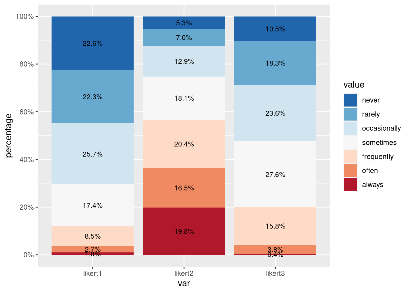
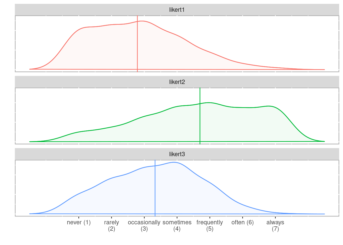
Different types of distribution plots can be built based on Likert items:
After the ‘gather’ function, it is required to transform the ‘value’ column into a factor and specify the levels order based on the original Likert scale. You will probably need to adapt the labels and the levels to your own Likert scale.
data %>%
  gather(key = "var", value = "value", likert1:likert3) %>%
  mutate(value = factor(value, levels=c("never", "rarely", "occasionally", "sometimes", "frequently", "often", "always"))) %>%
  ggplot(aes(x = var, y = ..count.., fill = value)) +
    geom_bar(stat = "count", position = "stack") +
    scale_fill_brewer(palette = "RdBu") # Set the color palette
The ‘likert’ function also offers the capability to partition the distribution plots based on grouping variables. It helps to explore potential variations and differences in the ratings based on specific factors of interest within their dataset. In the exemple, we split the distribution according to the ‘cond_perso’ variable.
library(likert)
vars_likert = c("likert1","likert2","likert3")

plot(likert(data[,vars_likert], grouping = data[,"cond_perso"]), legend.position="right",
     type="bar")
Further plots
Many functions from many packages allow creating distribution plots, each with specificities. Rather than making an exhaustive list, here are some useful functions that we found.
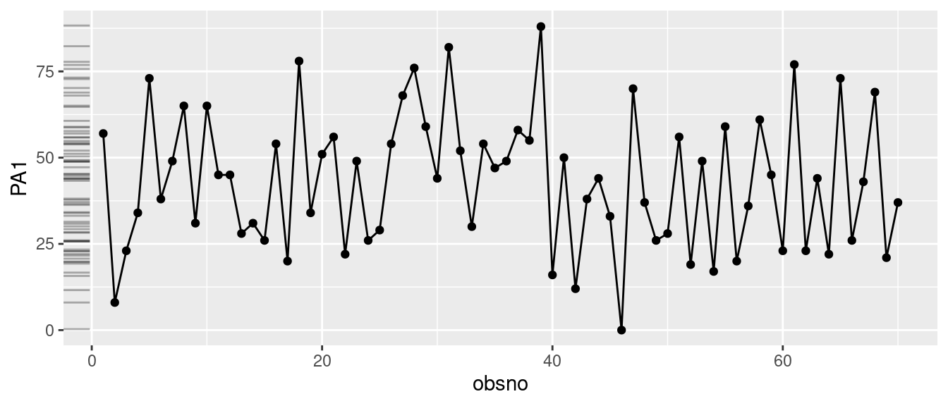
When visualizing time series data, incorporating marginal density or histogram plots alongside the main series offers a swift means to examine the distribution of values across the scale. We propose two methods:
- ‘ggMarginal()’ from the ‘ggExtra’ package: it allows to add marginal density or histogram plots to a ggplot2 scatterplot.
- ‘geom_rug()’ from the ‘ggplot2’ package: display the distribution of the variables with thin overlapping lines next to the x- or y-axis as a projection of the variables displayed in the plot.
library(ggExtra)
p = data %>% filter(id == 3) %>%
  ggplot(aes(x=obsno, y=PA1)) +
    geom_line() +
    geom_point()
ggMarginal(p, margins = "y", type = "histogram")
The ‘geom_density_ridges()’ function helps to split the distribution according to a grouping variable (using the y and fill arguments).
library(ggridges)
data %>%
  ggplot(aes(x=PA1, y=factor(cond_perso), fill=factor(cond_perso))) +
    geom_density_ridges(stat = "binline", bins = 25, scale = .9,
draw_baseline = FALSE, show.legend = FALSE) 


