Distributions of participant statistics
Packages: dplyr, tidyr, ggplot2
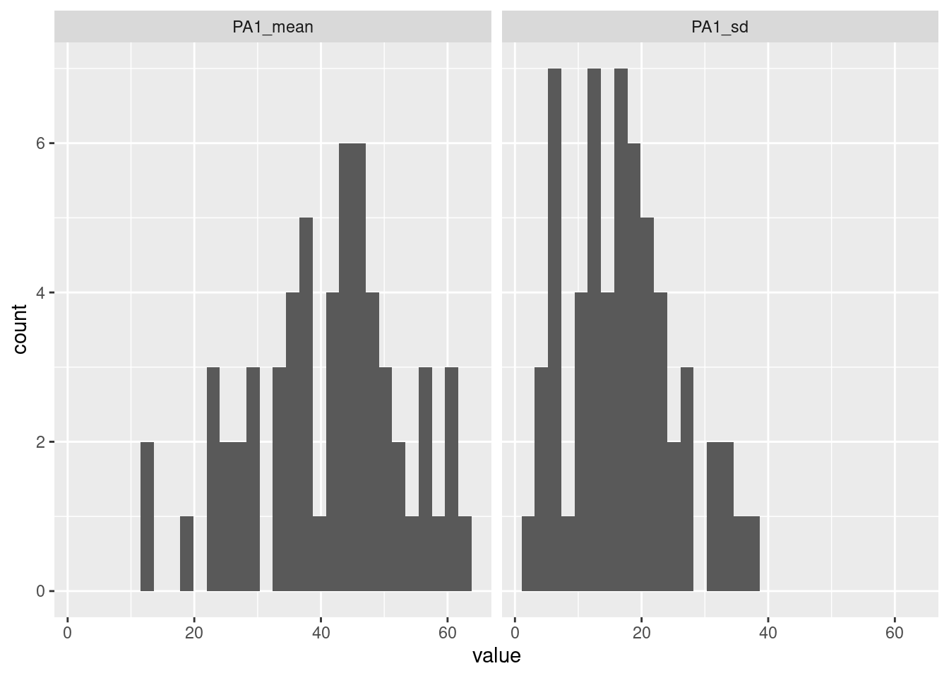
Central tendency (e.g., mean, median) and variability (e.g., standard deviation) metrics of participants can be important pieces of information to investigate between-subjects differences. It is also important information regarding the items collection: are participants responding similarly? is there a lot of variability? Hence, rather than investigating raw values (see ), we can compute the means or the standard deviations (e.g., standard deviation) for a specific variable of interest and for each participant. One of the best ways to investigate those statistics is to plot them into distribution plots. As in the Distribution plots section, we can plot one or multiple variables at once.
Going a step further, we can merge the distributions plots together to have the distributions of the means and the standard deviations side by si de.
data %>%
    group_by(id) %>%
    summarise(PA1_mean = mean(PA1, na.rm=TRUE),
              PA1_sd = sd(PA1, na.rm=TRUE)) %>%
    gather(variable, value, PA1_mean:PA1_sd) %>%
    ggplot(aes(x=value)) +
        geom_histogram()+
        facet_grid(.~variable)
Finally, instead of illustrating distributions, we can create a plot that clearly presents the mean and standard deviation for a specific variable for each participant. We propose two versions of the plot, organizing participants based on:
- their id number.
- the values of their mean (or standard deviation) for PA.
marge = 1.5
data %>%
    group_by(id) %>%
    summarise(mean_PA1 = mean(PA1, na.rm=TRUE),
              sd_PA1 = -sd(PA1, na.rm=TRUE)) %>%
    gather(variable, value, mean_PA1:sd_PA1) %>%
    separate(variable, c("stats", "variable"), "_") %>%
    mutate(PA = ifelse(stats=="mean", value, value),
           id = as.factor(id)) %>%
    ggplot(aes(x=PA, y=id, fill=stats)) +
        geom_col() +
        annotate(geom = "rect", xmin = -marge, xmax = marge,
                 ymax = Inf, ymin = -Inf,
                 fill = "#ffffffb0") +
        annotate(geom = "text", x = 0, size=2,
                 y = levels(factor(data$id)),
                 label = levels(factor(data$id))) +
        theme_bw() +
        theme(axis.text.y = element_blank(),
              axis.title.y = element_blank(),
              axis.ticks.y = element_blank(),
              panel.grid.major.y = element_blank(),
              plot.title = element_text(size = 16, hjust = 0.5))


