Area plot
Packages: dplyr, tidyr, ggplot2, ggTimeSeries
An area plot is a type of chart used to display quantitative data over time, often used in time series analysis. It is similar to a line plot, but the area between the line and the horizontal axis is filled with color, or a pattern. The main advantage is that it better represents the quantity being measured.
In ggplot2 package, you can use the geom_area function. To enhance the plot, you can add a line (geom_line()) and points (geom_point()). It has the advantage to better represent the missing values in the time series (no points and line breaks). Here is the code to create an area plot for a single participant:
data %>%
  filter(id == 1) %>%
  ggplot(aes(x=obsno, y=PA1)) +
    geom_area(fill="#452bba", alpha=0.4, size=.5) +
    geom_line(color="#2300bd", size=2) +
geom_point(size=1.5, color="#2300bd") 
You can also cumulate (as a sum function) the time series of different variables. It is particularly interesting when all the variables are associate to a same construct. Indeed, you can easily visuzalize the cumulative sum of the variables but also compare there values over time.
data %>%
  filter(id == 1) %>%
  gather(cat, val, PA1:PA3) %>%
  ggplot(aes(x=obsno, y=val, fill=cat)) +
    geom_area(alpha=0.5 , size=.5)
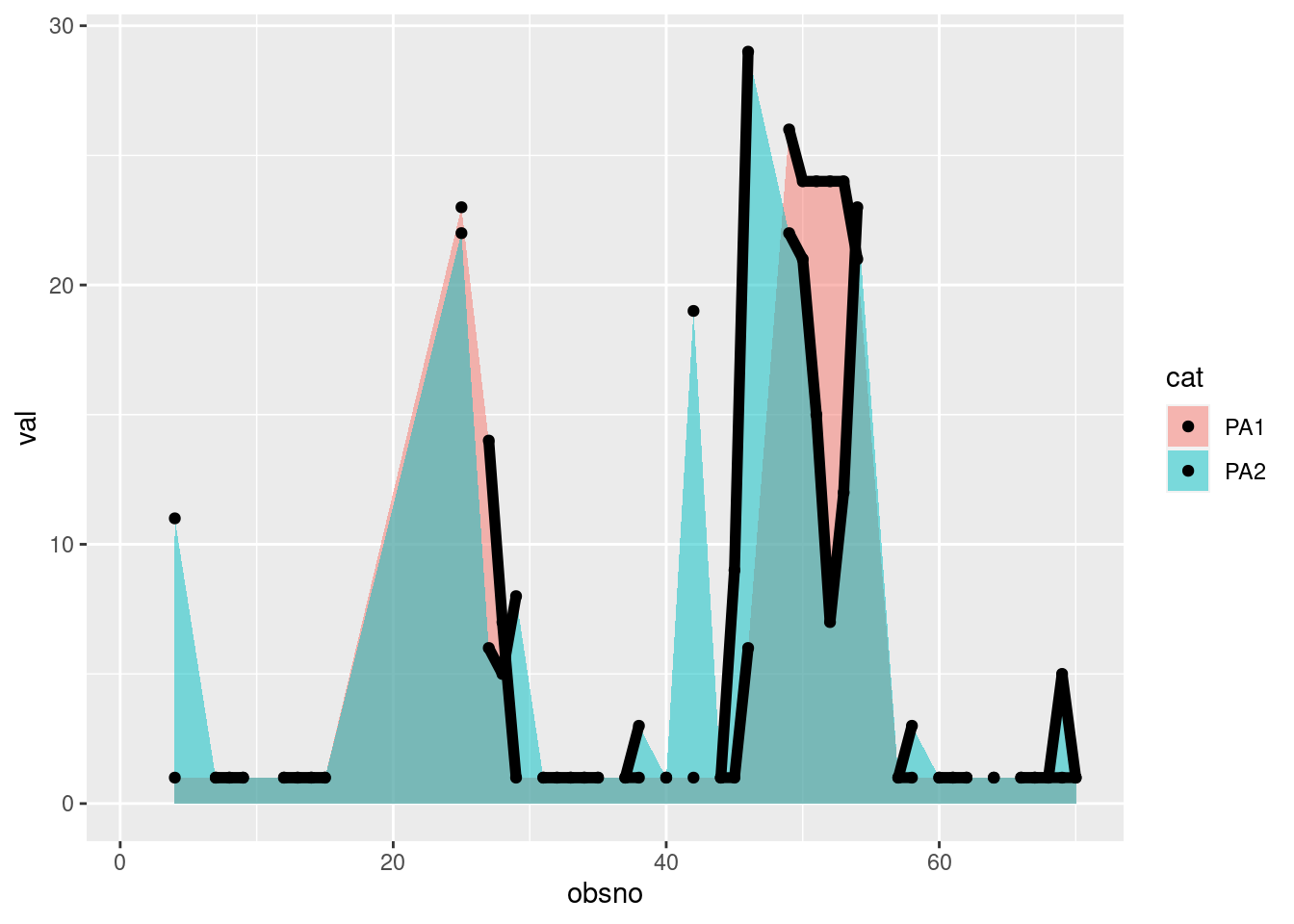
If you are only interested in dipslaying an area below the the line but not to a cumulative score, you can use position=position_dodge(). Be sure to set the alpha argument of the geom_area to lower values, otherwise the area will probably hide another one.
data %>%
  filter(id == 1) %>%
  gather(cat, val, PA1:PA2) %>%
  ggplot(aes(x=obsno, y=val, fill=cat)) +
    geom_area(alpha=0.5 , size=.5, position = position_dodge()) +
    geom_line(size=2) +
geom_point(size=1.5) 
If you are more interested in investigating the relative difference between variables rather than the culmulative score, you can use position=“fill”, as follows:
data %>%
  filter(id == 1) %>%
  gather(cat, val, PA1:PA3) %>%
  ggplot(aes(x=obsno, y=val, fill=cat)) +
    geom_area(alpha=0.5 , size=.5,position='fill')
Goying beyond displaying items from one concept, you can opposite two items’ concepts in a plot. We only negate the second concept’s item below zero, as follows:
palette = c("#72EFDD", "#48BFE3", "#5E60CE", "#DA1E37", "#B21E35", "#6E1423")
data %>%
  filter(id == 32) %>%
  mutate(NA1 = -NA1,NA2 = -NA2, NA3 = -NA3) %>%    # Negative values to display it below zero
  gather(cat, val, PA1:NA3) %>%
  ggplot(aes(x=obsno, y=val, fill=cat)) +
    geom_area(alpha=0.5 , size=.5) +
    scale_fill_manual(values=palette)
To go beyond one participant, you can use the facet_wrap() (or the facet_grid()) function to display time series of multiple participants.
data %>% filter(id <= 20) %>%
  gather(cat, val, PA1:PA3) %>%
  ggplot(aes(x=obsno, y=val, fill=cat)) +
    geom_area(alpha=0.5 , size=.5) +
    facet_wrap(id~., ncol=4)
Steamgraph
A steamgraph works by stacking the different variables on top of each other, and then using color to represent the proportion of each variable at any given point in time. As for the area plot, one of the main advantages of using a steamgraph is that it allows you to see how the different variables are changing relative to each other. By looking at the graph, you can quickly see how these different variables are related, and how they are changing over time.
To create a steamgraph, you can use the stat_steamgraph from the ggTimeSeries packages.
library(ggTimeSeries)
data %>%
  filter(id==1) %>%
  gather(var, val, PA1:PA2) %>%
  ggplot(aes(x = obsno, y = val, group = var, fill = var)) +
  stat_steamgraph()
Again, you can visualize multiple participants’ time series.
data %>% filter(id <= 20) %>%
  gather(var, val, PA1:PA2) %>%
  ggplot(aes(x = obsno, y = val, group = var, fill = var)) +
    stat_steamgraph() +
facet_wrap(id~., ncol=4) 
It can be particularly interesting to create a steamgraph for the whole dataset over obsno. Trend or pattern in the data over all the participant could be better highlighted.
df_obsno = data %>%
  group_by(obsno) %>% # Only meaning if everyone have the beep at the same time
  dplyr::summarise(across(PA1:NA3, ~ sum(.x, na.rm=TRUE)))

df_obsno %>%
  gather(var, val, PA1:NA3) %>%
  ggplot(aes(x = obsno, y = val, group = var, fill = var)) +
stat_steamgraph() 