Item response interact
Packages: dplyr, tidyr, ggplot2
Whenever a participant can choose not to answer a part of the items, it can be interesting to investigate how much participants reported (or interacted with) each item when they start answering a beep or over all the items sent to the participants. We could investigate if there are preferences for answering specific items or if there are trends over time in the reported items. Note that, for better accuracy, the missed beeps by the participant should be all present in the dataset (see the Check and fill missing beeps section if needed).
As a first investigation, we can use the ‘valid_var’ variable to see the distribution of the number of missing values per row (over the variables of interest).
ggplot(data,aes(x=valid_var)) +
  geom_histogram() +
scale_x_continuous(breaks=c(1:100)) 
For the following plots, we propose to use two specifications/positions for the bar plot:
- the stack position to compare the absolute values between the number of (non-) interactions.
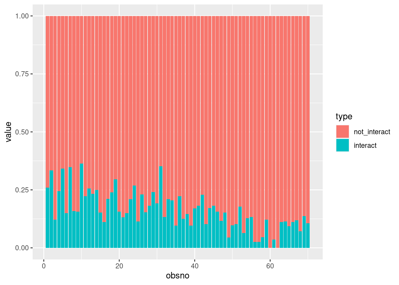
- the fill position to compare their relative values.
Both types of plots highlight different information and do not lead to the same conclusions.
Over items
The easiest way to investigate the number of interactions with the items is to plot it. First, we need to compute the number of answered (not-missing) per item of interest. Note that the variables of interest are specified in the first ‘mutate()’ function (e.g., ‘PA1:position’). We can compare the number of interactions with:
- The number of started surveys: using the ‘start’ variable
- The number of sent beeps to the participants: using the ‘sent’ variable
df_interact = data %>%
  mutate(across(c(start, PA1:location), ~ !is.na(.x))) %>%
  summarise(across(c(PA1:location), sum),
            open = sum(start)) %>%
  gather(item, interact, PA1:location) %>%  # reshape the data by stacking columns from PA1 to location
  mutate(not_interact = open - interact) %>%
gather(type, value, interact, not_interact) # reshape the data by stacking columns interact and not_interactThen, we plot the number of interactions and non-interaction.
df_interact %>%
  mutate(type = factor(type, levels=c("not_interact", "interact"))) %>%
  ggplot(aes(x=item, y=value, fill=type)) +
geom_col(position="stack") 
Participant-specific
We can go a step further and investigate the between- and within-participant variation by plotting the number of interactions (non-interactions) for each item per participant. We first compute ‘group_by’ the ‘id’ variable:
df_interact_id = data %>%
  mutate(across(c(start, PA1:location), ~ !is.na(.x))) %>%
  group_by(id) %>%
  summarise(across(c(PA1:location), sum),
            open = sum(start)) %>%
  gather(item, interact, PA1:location) %>% # reshape the data by stacking columns from PA1 to location
  mutate(not_interact = open - interact) %>%
gather(type, value, interact, not_interact) # reshape the data by stacking columns interact and not_interactThen, we plot:
df_interact_id %>%
  filter(id<10) %>% # select a subset of participants
  mutate(type = factor(type, levels=c("not_interact", "interact"))) %>%
  ggplot(aes(x=item, y=value, fill=type)) +
    geom_col(position="stack") +
    facet_wrap(id~.)
Over time: obsno-level
Interactions with items can be different over time. First, we need to compute the number of reported items over all the interactions with the questionnaire. To do so, we rely on missing values in each variable. Again, we can compare the number of interactions with the number of started surveys (using the ‘start’ variable) or the number of sent beeps to the participants (using the ‘sent’ variable).
df_interact_obsno = data %>%
  mutate(across(c(start, PA1:location), ~ !is.na(.x))) %>%
  group_by(obsno) %>%
  summarise(across(c(PA1:location), sum),
            open = sum(start)) %>%
  gather(item, interact, PA1:location) %>%  # reshape the data by stacking columns from PA1 to location
  mutate(not_interact = open - interact) %>%
gather(type, value, interact, not_interact) # reshape the data by stacking columns interact and not_interactThen, we can seek for trends in the number of interactions and/or reported items over the beeps number:
- For a specific variable
df_interact_obsno %>%
  filter(item=="PA1") %>%
  mutate(type = factor(type, levels=c("not_interact", "interact"))) %>%
  ggplot(aes(x=obsno, y=value, fill=type)) +
geom_col(position="stack") 
- For each variable
df_interact_obsno %>%
  mutate(type = factor(type, levels=c("not_interact", "interact"))) %>%
  ggplot(aes(x=obsno, y=value, fill=type)) +
    geom_col(position="stack", stat="identity") +
    facet_grid(item~.)
Over time: Day-level
Finally, we can also change the time level and see how much they interact/report items at the day level. To do so, we rely on the ‘daycum’ variable (see Cumulative day). Following the beep level, we use equivalent methods to compute it at the day level. Again, we can compare the number of interactions with the number of started surveys (using the ‘start’ variable) or the number of sent beeps to the participants (using the ‘sent’ variable).
df_interact_daily = data %>%
  group_by(id, daycum) %>%
  summarise(across(c(start, PA1:location), ~ sum(!is.na(.x)) > 0)) %>%
  group_by(daycum) %>%
  summarise(across(c(PA1:location), sum),
            open = sum(start)) %>%
  gather(item, interact, PA1:location) %>%  # reshape the data by stacking columns from PA1 to location
  mutate(not_interact = open - interact) %>%
gather(type, value, interact, not_interact) # reshape the data by stacking columns interact and not_interactAs for beep-level, we can visualize if there is a trend in the number of interactions and/or reported items over the day number:
df_interact_daily %>%
  mutate(type = factor(type, levels=c("not_interact", "interact"))) %>%
  ggplot(aes(x=daycum, y=value, fill=type)) +
    geom_col(position="stack", stat="identity") +
    facet_grid(item~.)

