Response rate
Packages: dplyr, lubridate, ggplot2
The response rate is different from the compliance rate. The latter is defined as the proportion of observations fulfilled by the participant, the first is the raw number of completed beeps or the average of completed beeps. It is often easier to investigate the response rate over grouping conditions (i.e., participant, day number, beep number) as it does not involve the computation of a proportion. It can be investigated in different ways: look at trends in the number of beeps answered over time, or assess the number of observations that will contribute to the estimation procedure.
We based the computation of the response rate on the ‘valid’ variable which specifies if an observation is valid (using pre-defined rules) as follows: 1=valid, 0=invalid (see flag valid observation section). Note that the code of the valid variable may differ from one study to another and can be more complex.
Quantity of valid observations
We can start by looking at the overall number of valid observations in the dataset. This information might help to better understand the later plots. To do so, we compute the number of rows after filtering the dataset based on the valid variable (i.e., data$valid==1).
nrow(data[data$valid==1,])[1] 1096Following, we can check the number of valid observation per participant, in two different and complementary ways:
- an histogram plot.
- a bar plot.
data %>%
    filter(valid==1) %>%
    group_by(id) %>%
    mutate_at(vars(id),as.factor) %>%
    summarize(n = n()) %>%
    ggplot(aes(x=id,y=n)) +
        geom_col(position = "dodge") +
        theme(axis.text.x = element_text(angle = 90, hjust = 1))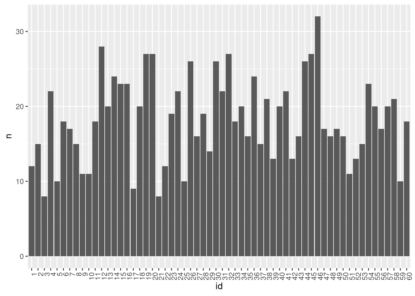
Above, we can see that the number of valid observations per participant is most often around 15.
These plots might resemble those showing compliance rates. However, a crucial distinction here is the preservation of information regarding the number of valid observations per condition. This detail is particularly significant concerning the sample size in analyses.
Quantity of valid observations in time
Response rate can be effectively combined with other factors, such as time-related variables, to provide a more nuanced investigation. Indeed, beeps may not have been answered consistently over time. We check this aspect by visualizing the number of valid beeps per observation number (‘obsno’ variable) or per cumulative day (‘daycum’ variable) in the study over all participants. To create those two variables, see the create time variables section.
data %>%
  filter(valid==1) %>%
  group_by(obsno) %>% summarize(n = n()) %>%
  ggplot(aes(x=obsno,y=n)) +
      geom_col(position = "dodge")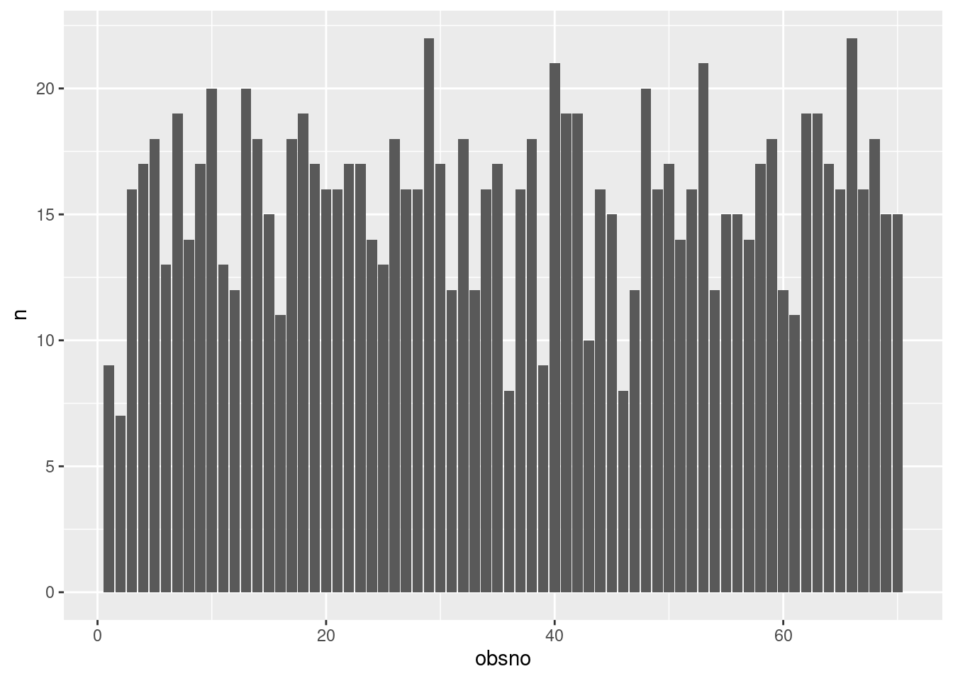
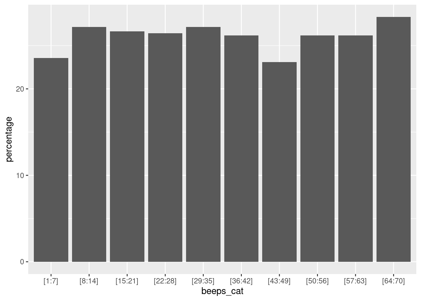
To gain insights into the distribution of valid observations, we can group beep numbers into bins. Essentially, this involves creating specific intervals of beep counts (for example, 1-5, 6-10) and then analyzing the quantity of valid observations within each of these ranges. First, this binning process can be efficiently achieved using the ‘create_bins’ custom function, which allows us to create bins based on the number of observations:
create_bins <- function(x, n_bins) {
  range_max <- max(x, na.rm = TRUE)
  range_min <- min(x, na.rm = TRUE)
  bin_width <- ceiling((range_max - range_min) / n_bins)

  breaks <- seq(range_min, range_max, by = bin_width)
  if (tail(breaks, n=1) != range_max) {
      breaks <- c(breaks, range_max + 1)
  }

  labels <- paste("[", head(breaks, -1), ":", tail(breaks, -1) - 1, "]", sep="")
  categories <- cut(x, breaks = breaks, labels = labels, include.lowest = TRUE, right = FALSE)
  return(categories)
}
Next, we can either display the absolute number of valid observations per bin, or compute the percentage of valid observations per bin. The percentage score is particularly useful when there is a varying number of sent beeps across the study duration.
n_bins = 10 # Number of bins
data %>%
  filter(valid==1) %>% # Remove NAs values
  mutate(beeps_cat = create_bins(obsno, n = n_bins)) %>%  # Customize bins using the argument n
  ggplot(aes(x=beeps_cat)) +
    geom_bar()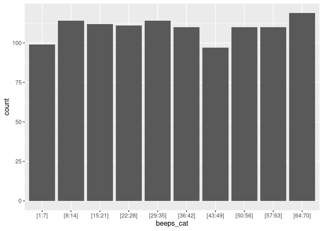
Average of valid observations in time
To gain deeper insights into the response rate over time, we can shift our focus to analyzing the average response rate across various time periods, such as by day or by weekday. This method offers a more granular perspective, allowing us to uncover potential trends and patterns in how response rates fluctuate over time.
A good starting point for this analysis is to examine the distribution of the average number of beeps answered per day, spread across different participants. To achieve this, we’ll first calculate for each participant: the number of valid observations divided per the length of the study period in days. Here, we need the ‘daycum’ variable (see create time variables section).
nb_days = as.integer(max(data$daycum, na.rm=TRUE)) # Number of days
data %>%
    group_by(id) %>%
    summarise(avg_valid = sum(valid) / nb_days) %>%
    ggplot(aes(x=avg_valid)) +
        geom_histogram()
Now, we can visualize the average number of valid observations in function of the different time variables (to compute them see create time variables section):
- The ‘daycum’ variable to see whether the distribution of number of answers per day for each participant decreases or increases over the days.
- The day of the week (week day vs. weekend day) to see if the distributions of the response rate per day are different between the two types of days.
- The period of the day (e.g., morning, afternoon, evening) to see if the distributions of response rate is different between the different periods of the day.
data %>%
    group_by(id, daycum) %>%
    summarise(sum_valid = sum(valid)) %>%
    ggplot(aes(x=factor(daycum), y=sum_valid)) +
        geom_boxplot(outlier.shape = NA) +
        geom_jitter(alpha=.3)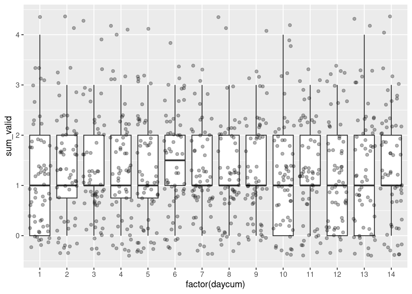
Person or group-level variables implementation
Another level of analysis is to look into the effect of person or group-level variables on the response rate. Indeed, the response rate may differ between participants or groups of participants based on age or gender. For instance, we can visualize the number of valid observations per participant and age.
data %>% filter(valid==1) %>%
    group_by(id, age) %>%
    summarize(n = n()) %>%
    ggplot(aes(x=age, y=n)) +
        geom_point() +
        geom_smooth()
We could also combine between-person differences with a time variable. For instance, we could check if there is an interaction between the role and the period of the day.
data %>%
    group_by(role, id, period) %>%
    summarise(valid = sum(valid)) %>%
    ggplot(aes(y=valid, x=period, fill=factor(role))) +
        geom_boxplot() +
geom_jitter() 
Dyad
Finally, in dyadic ESM studies, we can face the challenge of analyzing the response rate at the dyad level. In particular, two importants aspects can be considered:
- Simultaneous responding: the partners answered the same beep.
- Lagged responding: the previous partners’ observations at time t-1 are followed by an observation at time t. In longitudinal dyadic analysis, having valid observations at time t for one partner and at t-1 for the other partner can be essential, especially for inclusion in estimations when employing a list-wise deletion method.
Below, we will investigate those to aspects. First, we need to merge partners’ data side by side and then create a lagged version of the valid variables (see the dataframe format section).
df = data %>% select(dyad, id, role, obsno, valid)
df_partner = df %>% mutate(role = ifelse(role==1, 0, 1))
df_dyad = df %>% left_join(df_partner, by = c("dyad", "role", "obsno"), suffix = c("", "_pn")) %>%
    group_by(dyad, role) %>%
    mutate(valid_lag = lag(valid), # Allow to compute lag and partner lagged observation
           valid_pn_lag = lag(valid_pn))
Now, we want to visualize:
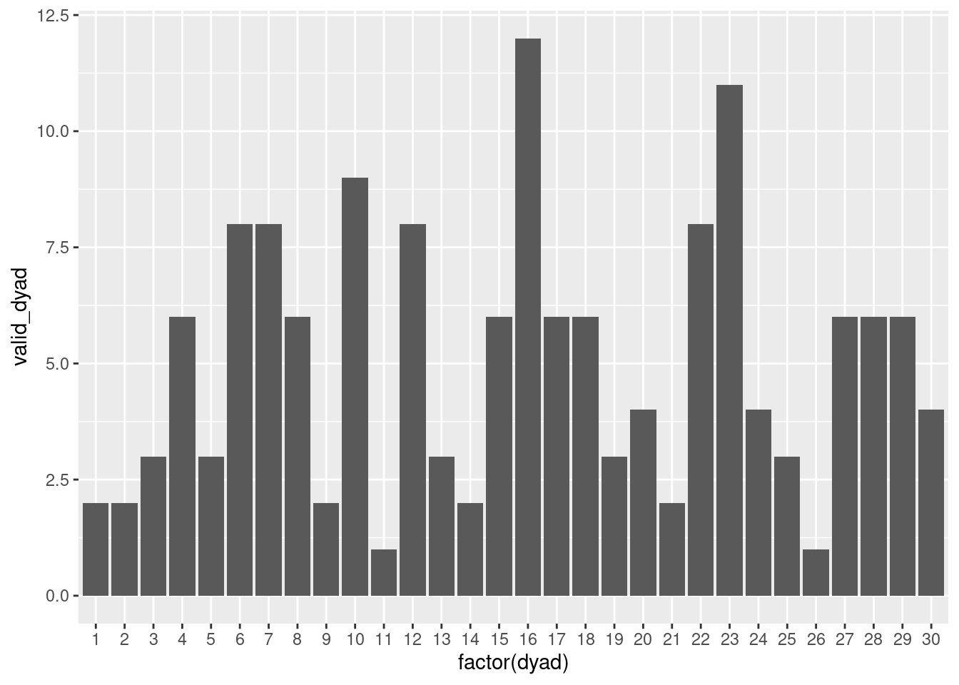
- The number of observations per dyad that fulfill only the first aspect. It may provide interesting insights when we want to investigate the contemporaneous effect in dyads.
- The number of observations per dyad that fulfill the first and the second aspects. It may provide interesting insights when we want to investigate the contemporaneous and lagged effect in dyads.
df_dyad %>% filter(role == 1) %>% # only need one pp per dyad
    group_by(dyad,id) %>%
    mutate(valid_dyad = ifelse(valid == 1 & valid_pn == 1, 1, 0)) %>%
    summarise(valid_dyad = sum(valid_dyad)) %>%
    ggplot(aes(x=factor(dyad), y=valid_dyad)) +
        geom_col()