Delay to start and to fill
Packages: dplyr, ggplot2
The time spent by the participant to start the survey (‘delay_start_min’) and the time to answer it (‘delay_end_min’) are crucial pieces of information to investigate the participants’ response behaviors. However, one important requirement is to have the ‘sent’ (timestamps of when the beep was sent), ‘start’ (timestamps of when the participant started the beep), and ‘end’ (timestamps of when the participant ended the beep) variables in the dataset. With those variables in place, we can compute the ‘delay_start_min’, we need to calculate the difference between the time when the beep was sent to the participant (‘sent’) and the time when the participant started it (‘start’). Similarly, to compute the ‘delay_end_min’, we need to calculate the difference between the time when the participant started the survey (‘start’) and the time when the participant ended it (‘end’). Here is an example of how to compute these variables taking as units the minutes (units=“mins”):
Other time units can be used such as seconds (units=“secs”), hours (units=“hours”), days (units=“days”), etc. It is good practice to name the variable in consequence, such as ‘delay_start_sec’, ‘delay_start_hour’, ‘delay_start_day’, etc.
data = data %>%
    mutate(delay_start_min = difftime(start, sent, units="mins"),
           delay_end_min = difftime(end, start, units="mins"))
Then, we can visualize these variables in histograms to get information about their distribution but also about any unexpected values. Unexpected values are:
- Negative values: it would imply that the participant began the questionnaire before receiving it or concluded the questionnaire before initiating it.
- Large values: it would suggest a significant delay in initiating or completing the survey (must be intepreted in function of the questionnaire lenght).
- Close to 0 value: it would suggest that the participant might not have paid sufficient attention to the questionnaire (must be intepreted in function of the questionnaire lenght). It holds only for the ‘delay_end_min’ variable.
data %>% filter(valid==1)  %>%
    ggplot(aes(x = delay_start_min)) +
        geom_histogram(bins=100)
Grouping and covariates variables
Building on these variables, we can further investigate participants’ response behaviors such as exploring potential predictors of the time to start or to fill the questionnaires, or investigating between-participants differences. Below, we will particularly demonstrate how to investigate differences between groups (e.g., participants) and how to explore the influence of time variables.
For the following plots, we will only use the ‘delay_end_min’ as a demonstration, but the ‘delay_start_min’ variable can be used as well.
Grouping-variables
Using these variables, generating plots to explore differences between groups becomes straightforward. For example, we can plot and examine variations in the delay to start (or the delay to fill) the questionnaires between participants. These visualizations can effectively reveal both between-group disparities and any outliers, whether they are between or within-participant outliers. To do so, we can create:
- a boxplot: to visualize the distribution of the delay_end_min variable for each participant.
- a boxplot and points: add points to the previous plot. To avoid duplication of outliers data points, we remove them from the geom_boxplot() function using ‘outlier.shape = NA’ argument. Additionnaly, we plot data point using the ‘geom_jitter()’ function.
- a histogram: using ‘geom_density_ridges’ function from the ggridges package
data %>% filter(valid == 1) %>%
    ggplot(aes(y=delay_end_min , x=factor(id))) +
        geom_boxplot() +
        coord_flip()
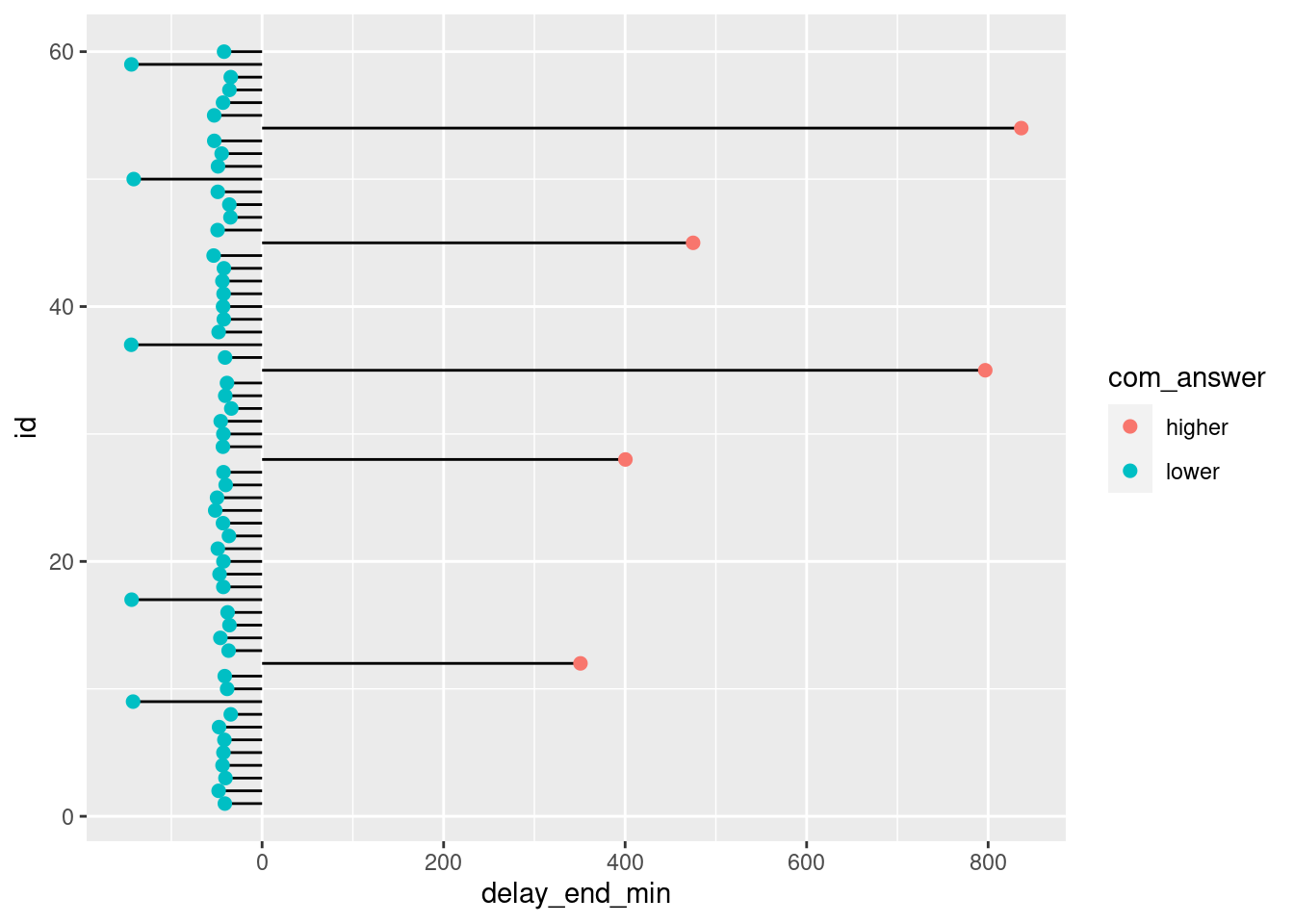
We might consider enhancing the emphasis on differences between participants to identify those who consistently take significantly more or less time, on average, compared to the entire participant group. To accomplish this, we introduce two approaches for calculating and visualizing the difference between each participant’s average time interval and the overall group average time interval.
mean_ = mean(data$end - data$start, na.rm=TRUE)
data %>%
    group_by(id) %>%
    summarise(delay_end_min = mean(delay_end_min, na.rm=TRUE) - mean_) %>%
    mutate(com_answer = ifelse(delay_end_min > 0, "higher", "lower")) %>%
    ggplot(aes(x=id, y=delay_end_min, label=delay_end_min)) +
        geom_bar(stat='identity', aes(fill=com_answer), width=.5)  +
        coord_flip()
From the above plot, we can see that 5 participants have a higher average time to fill the questionnaire compared to the group average, while 5 participants have a lower average time.
Time variables
We can also investigate if the time interval variables are influenced by time variables (to compute time variables used, see create time variables section). As an example, due to a decline in motivation throughout the study duration, participants might progressively spend less time answering questionnaires. In particular, we can investigate influence of:
- Day numbers with the ‘daycum’ variable.
- Observation numbers using a scatterplot and using the ‘obsno’ variable.
- periods of the week (e.g., week days, weekend days) with the ‘wday’ variable.
- periods of the day (e.g., morning, afternoon, evening) with the ‘period’ variable.
data %>% filter(valid==1) %>%
    ggplot(aes(y=delay_end_min, x=daycum)) +
        geom_jitter()
Covariates
Following the strategies presented in the two previous sections, we can investigate for predictors at a person- or group-level. For instance, we might expect that the participant’s age could influence the time to fill the questionnaire. To investigate this, we can use a scatterplot to visualize the relationship between the participant’s age and the time to fill the questionnaire.
data %>% filter(valid==1) %>%
    ggplot(aes(y=delay_end_min, x=age)) +
        geom_jitter()
From the above plot, there is no clear relationship between the age of the participant and the time to fill the questionnaire.


