Compliance rate
Packages: dplyr, ggplot2
The specific approach we follow here is based on the ‘valid’ variable. This variable is computed earlier in the preprocessing process to define whether a response is valid or not. However, you can easily adapt the code if you don’t want to use this variable.
Compliance is the proportion (or percentage) of valid observations for a participant (or a dyad). It is considered an important criterion to define the quality of the data in ESM studies. In order to compute it, you need to have defined what a valid observation constitutes in the context of your study or analysis (see Compute valid obs). Often it follows multiple rules such as the response time, the presence of values for the main variables, etc. From different definitions of valid observations, we would get different compliance scores.
Going a step further, we can also look into other types of proportion of valid observations, such as lagged compliance, dyad compliance. Finally, we can investigate for predictors of compliance.
Compliance participants
Compliance is computed for each participant as the number of valid observations divided by the total number of observations. To compute a compliance score, you can either inform the number of beeps programmed (‘obsno_max’) or compute the number of observations (fulfilled or not) of each participant in the dataset. The two approaches can be done using base R functions or the dplyr package.
It’s also crucial to acknowledge that the number of prompts participants are required to respond to may vary within an ESM study. This variation can occur if the study design is not consistent across participants, if the missed beeps were not recorded by the used software, or if there are discrepancies in prompt delivery—such as missing or additional prompts being sent to certain participants, either by accident or due to technical issues.
obsno_max = 70
data$compliance = ave(data$valid, data$id, FUN=function(x) sum(x, na.rm=TRUE)) / obsno_maxAn easy way to investigate the compliance scores across the participant is to plot them. Two types of plots are particularly relevant and propose different points of view on this variable:
- a bar plot that displays the compliance rate of each participant (x-axis).
- a histogram of the compliance rate which help to get the distribution of the scores.
data %>%
    group_by(id) %>% slice(1) %>%    # Keep one row per participant
    ggplot(aes(y=compliance, x=factor(id))) +
        geom_col(position = "dodge")
Excluding participants: You may have planned to remove participants based on a minimal compliance rate. Here, we use .5 compliance rate as a threshold. Hence, every participant that is below this threshold must be excluded from the dataset. Note that we chose this threshold value arbitrarily and it does not constitute a recommendation to follow.
thres_compliance = .5
data_exclud = data[data$compliance > thres_compliance,]
Other types of compliance
Lagged compliance
ESM studies collect data over time and often lagged models are used to investigate the relationship between variables. Hence, it is an important piece of information to know the proportion of observations that have valid data at the current time point (t) and previous time point (t-1). In other words, we can define compliance based on the number of sequential observations provided by the participant.
To compute the lagged compliance (‘lag_compliance’), we first need to establish the ‘lag_valid’ variable, which assumes a value of 1 when an observation and its preceding observations are both valid (0 otherwise). Then the lagged compliance is computed as the sum of ‘lag_valid’ divided by the maximum number of observations for each participant.
It is important to properly lag the ‘valid’ variable by taking into account the nested structure of the data (‘id’ variable).
df_lagcomp = data %>%
    group_by(id) %>%
    mutate(lag_valid = ifelse(valid == 1 & lag(valid)==1, 1, 0)) %>%
    summarize(lag_compliance = sum(lag_valid, na.rm=TRUE) / max(data$obsno))
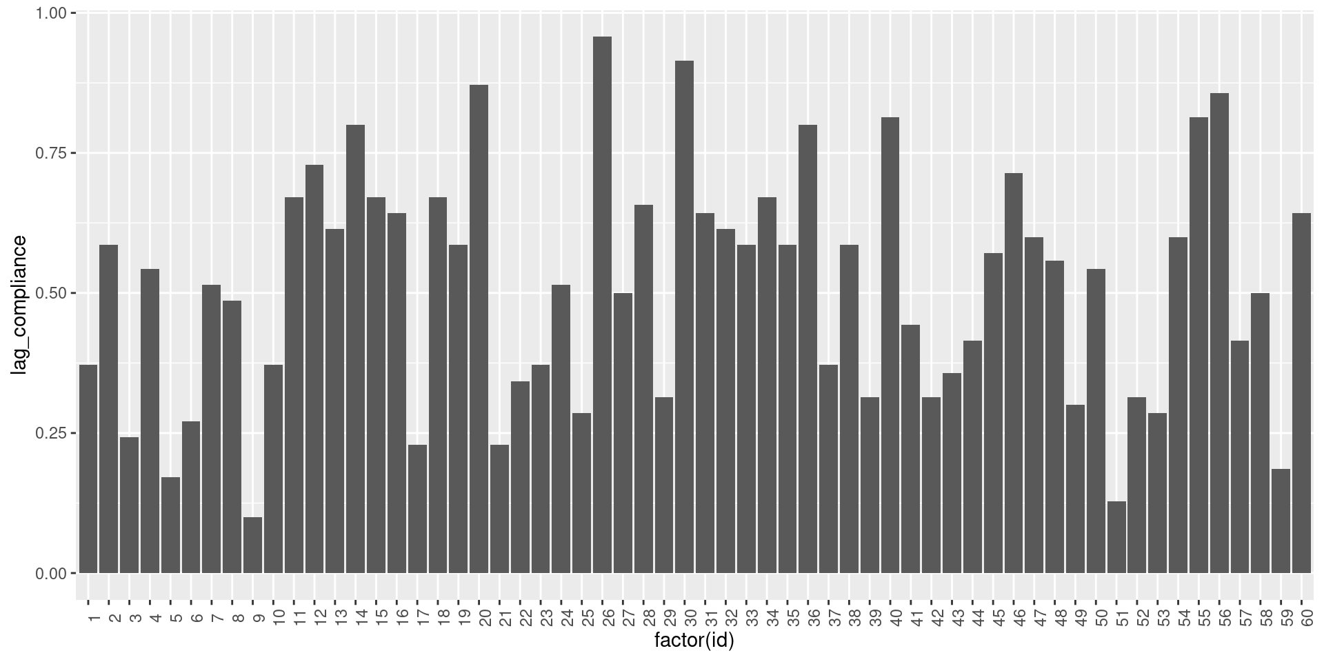
Now that the lagged compliance has been computed, we can visualize it as previously:
df_lagcomp %>%
    ggplot(aes(x=factor(id), y=lag_compliance)) +
        geom_col() +
        theme(axis.text.x = element_text(angle = 90))
Dyad compliance
In dyadic studies, it is also relevant to compute compliance at the dyad level. A dyad compliance score is then the proportion of beeps answered by both partners. In consequence, here we say that a beep is valid whenever both partners have answered to it. We propose two methods to compute it:
In computing the dyad compliance, we highly rely on the ‘obsno’ variable. This variable must associate each beep with a unique number and must be consistent within a dyad. In other words, the same beep (e.g., the first beep of the second day) must have the same ‘obsno’ value (e.g., 11) for both partners.
obsno_max = 70
# Create unique value for each obsno within dyads (later use for as grouping vector)
unique_dyad_beeps = paste0(data$dyad, "_", data$obsno)
# Check if beep was answered by two partners
valid_dyad_obs = ave(data$valid, unique_dyad_beeps, FUN=function(x) sum(x, na.rm=TRUE)) == 2
# Compute dyad compliance
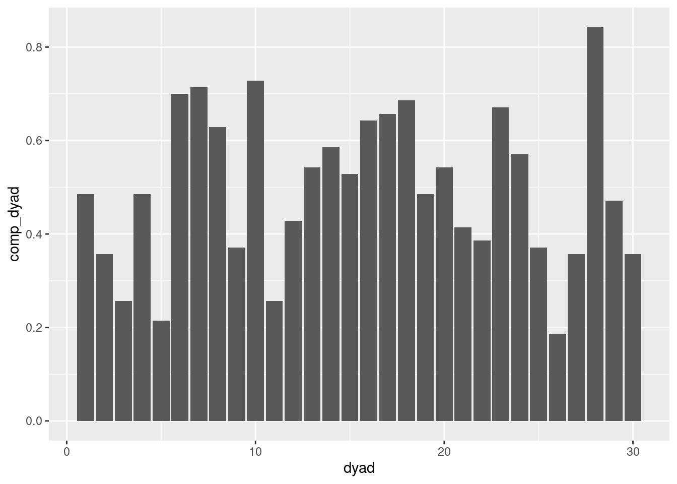
data$comp_dyad = ave(valid_dyad_obs, data$dyad, FUN=function(x) sum(x, na.rm=TRUE)) / 2 / obsno_maxNow that the dyad compliance has been computed, we can visualize it as previously:
data %>%
    group_by(dyad) %>% slice(1) %>%    # Keep one row per dyad
    ggplot(aes(x=dyad, y=comp_dyad)) +
        geom_col(position="dodge")
Dyadic lagged compliance
Building on the dyad compliance and the lagged compliance, we can also compute the dyadic lagged compliance. In this context, a beep is considered valid if both partners have answered to it and if the partner (or both partners) has answered to the previous beep. To compute it, we first need to reformat the data into a dyadic format (in which observations of each participant are side by side) and then lag valid variables for each partner.
dt = data %>% select(dyad, id, role, obsno, valid)
df_partner = dt %>% mutate(role = ifelse(role==1, 0, 1))
df_dyad = dt %>% left_join(df_partner, by = c("dyad", "role", "obsno"), suffix = c("", "_pn")) %>%
    group_by(dyad, role) %>%
    mutate(valid_lag = lag(valid), # Allow to compute lag and partner lagged observation
           valid_pn_lag = lag(valid_pn))
Following this, we can have two different definitions of a valid observation to compute compliance. Chosing one of the two must be done according to the research question and the context of the study.
- The observation should be valid for the actual participant as well as the one at time t-1 of its partner.
- Observations at time t and t-1 must be valid for both the participant and their partner.
df_dyad = df_dyad %>% filter(role == 1) %>% # only need one pp per dyad
    group_by(id) %>%
    mutate(com_obs = ifelse(valid == 1 & valid_pn_lag == 1, 1, 0)) %>%
    group_by(dyad) %>%
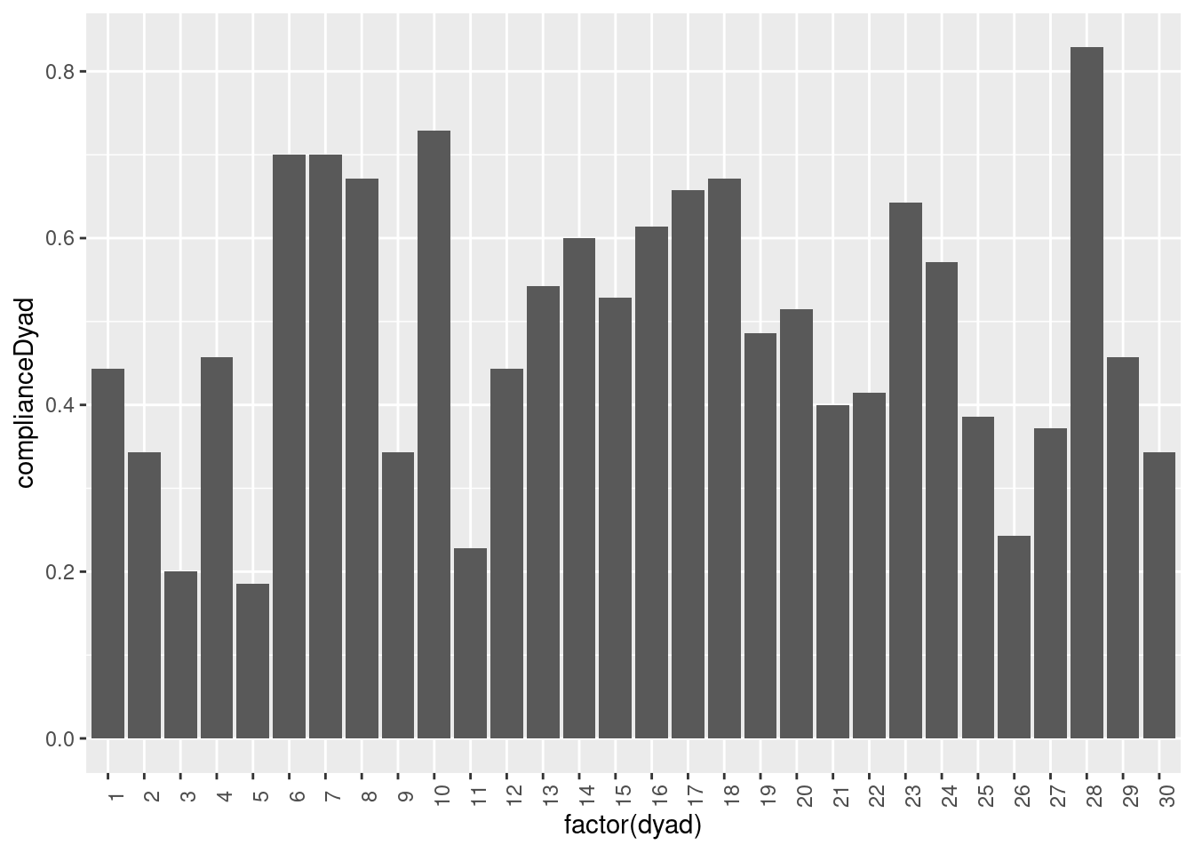
summarize(complianceDyad = sum(com_obs, na.rm=TRUE) / n())Again, we can plot this new variable.
df_dyad %>%
    ggplot(aes(x=factor(dyad), y=complianceDyad)) +
        geom_col() +
        theme(axis.text.x = element_text(angle = 90))
Person/group-level differences
Now that the compliance score has been computed, we can make an exploratory analysis to investigate potential predictors of compliance, whatever the type of compliance you are interested in. One first and simple step is to use plots. Here are some examples regarding the type of predictor:
- categorical variables: tacking the ‘role’ variable as an example, the first option is to display the mean and standard deviation of the compliance rate for each category of the variable, while the second option is to use a box plot to compare the distribution of compliance scores across the categories and the participants.
data %>%
    group_by(id) %>% slice(1) %>%
    ggplot(aes(x=factor(role), compliance)) +
        stat_summary(fun.y = mean, geom = "bar") +
        stat_summary(fun.data = mean_se, geom = "errorbar") +
        geom_jitter()
- Continuous variables: using the ‘age’ variable as an example, we can display the compliance rate for each participant as a function of their age in a scatter plot.
data %>%
    group_by(id) %>% slice(1) %>%    # Keep one row per participant
    ggplot(aes(y=compliance, x=age)) +
        geom_point()

