Sampling scheme plot
Packages: dplyr, ggplot2
A sampling scheme plot would help you to have a broad view of all the beeps, in particular here the beeps sent to the participants. It is a useful tool to identify any missingness, patterns in missingness, or design-related issues. In particular, it can serve as a building block for integrating other relavant information (see “Integrate other information” section).
Time frames
The beeps can be displayed regarding different timeframes, such as:
- Beep level
- Day level
- Study duration
Beep level
In this plot, each dot is a beep sent to the participant. It requires to first compute the ‘obsno’ variable.
Ensure that the computation of ‘obsno’ accounts for any potential missing beeps otherwise the plot will be biased.
data %>% filter(!is.na(sent)) %>%
    group_by(id, obsno) %>%
    ggplot(aes(x = obsno, y = factor(id))) +
        geom_point(size=1.5) +
theme(axis.text.x = element_text(angle = 90)) 
As all the beeps should have been sent to the participants, any missing dot in the plot would indicate a potential issue.
Day level
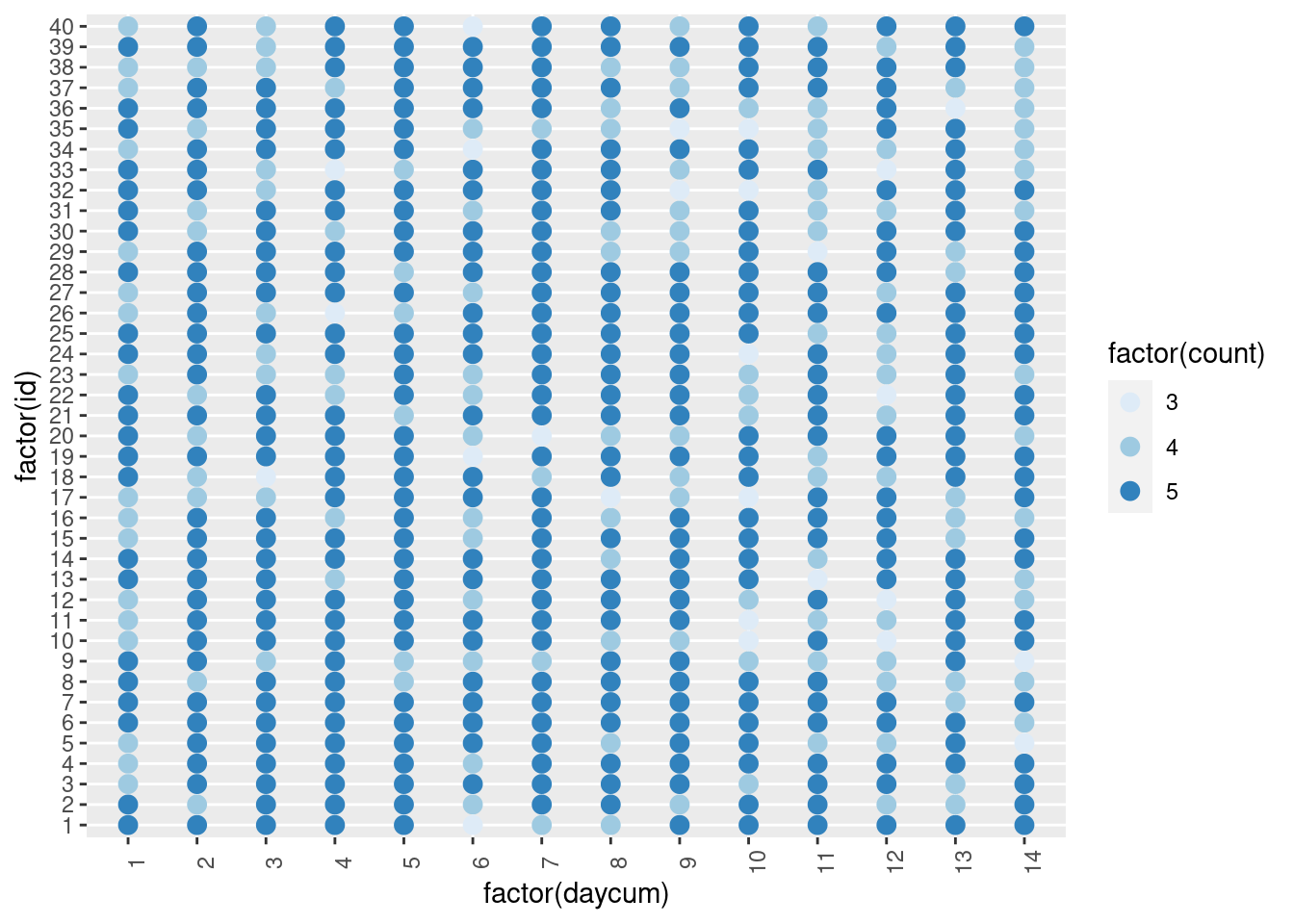
In this plot, each dot is a day for which the participant has at least answered one beep. It requires to first compute the ‘daycum’ variable. A color scale can be further used to display how many beeps have been sent in the day.
data %>% filter(!is.na(sent)) %>%
    group_by(id, daycum) %>%
    summarize(count = n()) %>%
    ggplot(aes(x = factor(daycum), y = factor(id))) +
        geom_point(aes(color=factor(count)),size=3) +
        scale_colour_brewer() +
theme(axis.text.x = element_text(angle = 90)) 
We can see that there is a large decrepency in the number of beeps sent per participant and per day, which is not expected. Further investigation is needed to understand the reason behind this issue.
Study duration
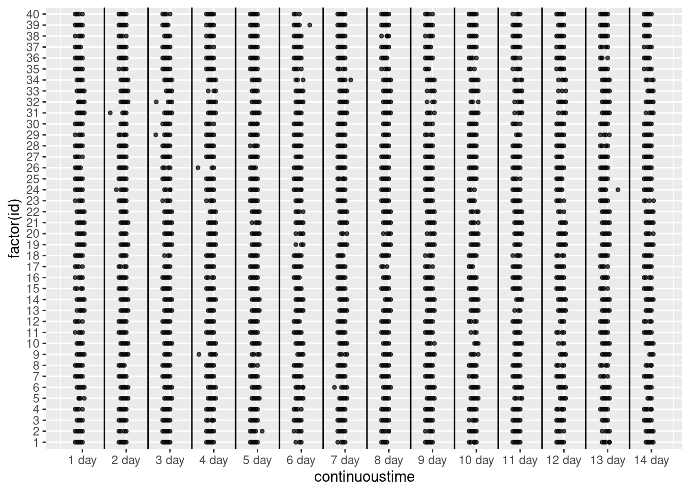
In this plot, each dot is a beep sent to a participant on a continuous time scale, with 0 being the first day of the ESM study for the participant and the time interval being in minutes. First, we need to compute the continuous time variable (‘continuoustime’) starting from the start of the first day for each participant.
# Handle x labels and breaks
breaks_ = seq(0, 1000000, 1440)[-1]  # Create vector of end of day values (in minutes)
labels_ = paste0(1:(length(breaks_)), " day")  # Create day labels

# Values for vertical lines (lower than maximal continuous time value)
breaks_limit = breaks_[breaks_ < max(data$continuoustime)]

# Create plot
data %>%
    ggplot(aes(x=continuoustime, y=factor(id))) +
        geom_point(size=1, alpha=.7) +
        scale_x_continuous(breaks = breaks_ - 720, label=labels_) +
        geom_vline(xintercept=breaks_limit)
On this last plot, any irregularity would indicate a potential issue, such as dots close to the vertical lines (which signify start/end of days), missing dots in a day for a participant, or, in case of time-contingent sampling, a dot that is inconsistent over day/participants. In the above plot, we can see that some dots seem to be outliers, split from the rest of the pattern.
Integrate other information
This type of plot is particularly useful for displaying other important pieces of information. For instance, the plot can be colored regarding the type of beep (e.g., random, event-contingent), activity (e.g., eating, working), or time-related information (e.g., weekday, weekend day). We present three examples:
- Weekday vs. weekend day: If the sampling protocol differs between weekdays and weekend days, it is straightforward to verify if the correct number of prompts has been sent based on the specific day. To accomplish this, the initial step involves computing the ‘weekday’ variable, which indicates the specific type of day for each beep. In addition, we use the previously introduced ‘daycum’ variable.
- Phase number: if an ESM study has different phases (e.g., 0, 1), we can use the plot to check if the beeps are consistently labeled over the study and for each participant. For instance, the plot below shows phase 1 observations occurring in the middle of phase 0, and vice versa, which is unexpected.
- Number of the beep in a day: it can be done as shown below by using the variable that indicates the rank order of the beep within a day.
data %>%
    ggplot(aes(x = factor(daycum), y = factor(id))) +
        geom_point(aes(color=weekday))

